Dogs Love Us
Brett led this project during his 17-year tenure as Thinkso’s founder and executive creative director.
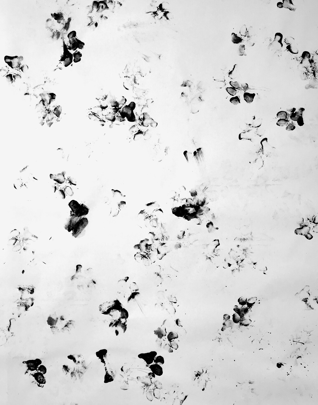
We retooled the identity and packaging for niche dog treat company Dogs Love Kale — evolving the name to Dogs Love Us in order to more effectively expand and reorganize the brand architecture. The unique brand voice and design concept celebrate the uncontainable feeling of excitement that dogs have at treat time — which we affectionately call the “happy dance.”

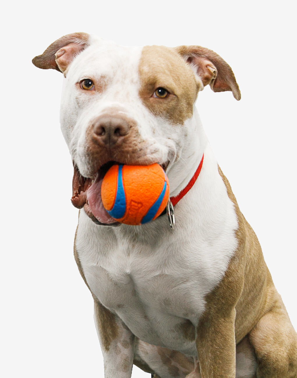
‘Happy dance’ sums up the rebrand perfectly. It’s the reason we started this business — to take care of and enjoy our furry family members — and it really resonates with our customers.
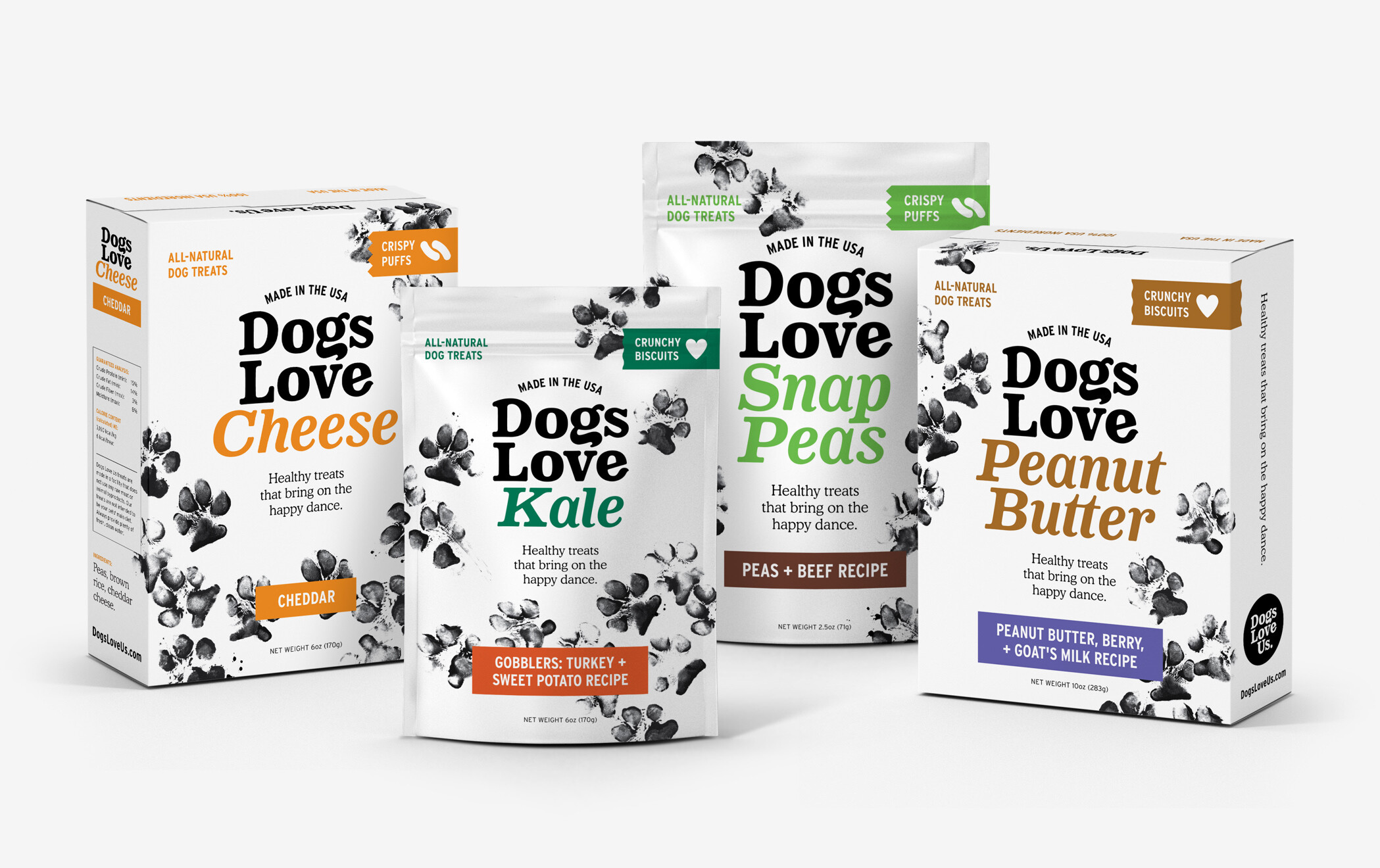
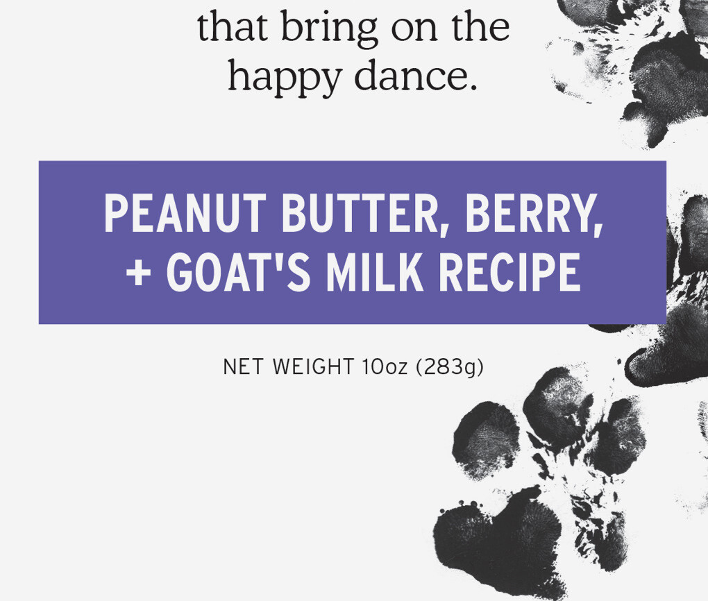
With crowd-pleasing flavors such as peanut butter, cheese, and liver added to the plant-based legacy flavors, we designed a product logotype system that allows for variability across the packaging program.
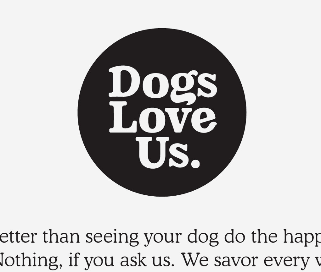
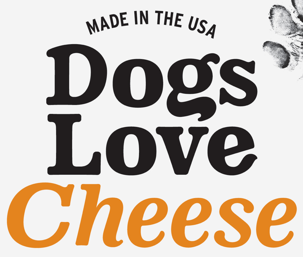
The Dogs Love Us logotype appears when representing the brand overall. We drew it to look “huggable” using soft, round letterforms and flourishes reminiscent of tails and ears.
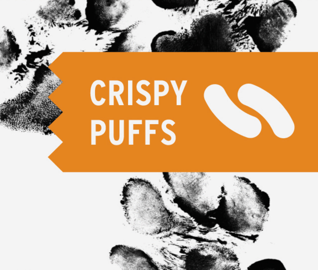
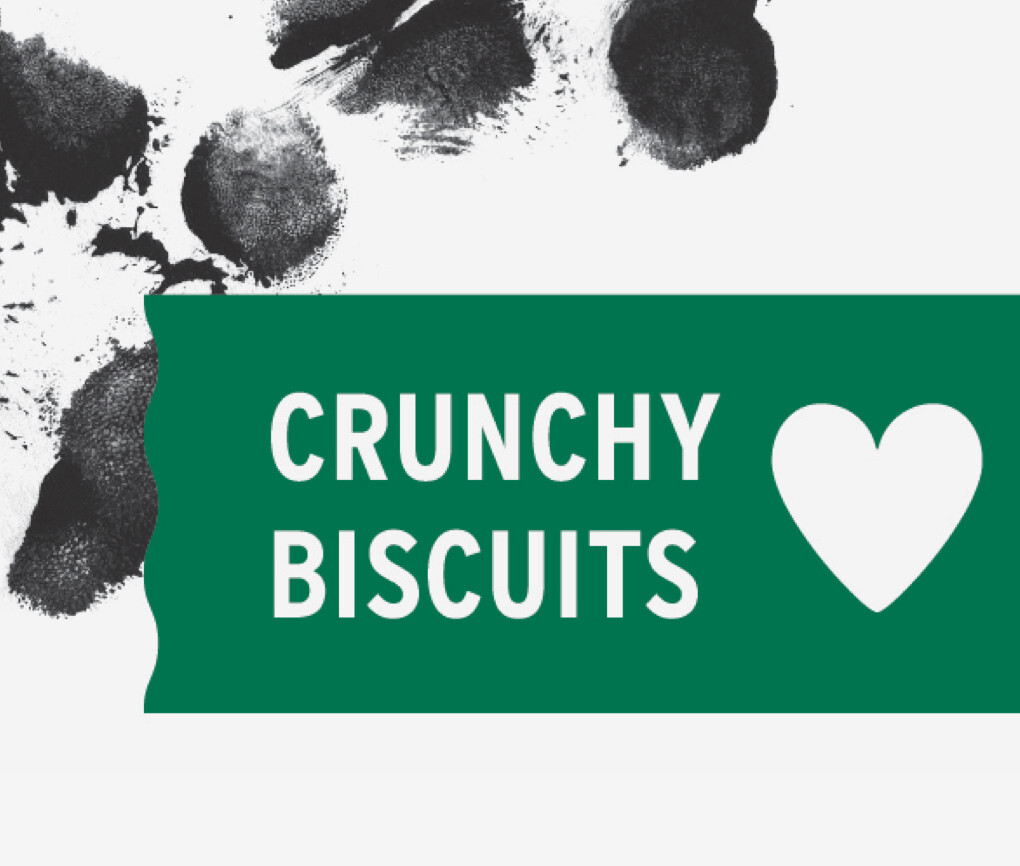
We designed a range of boxes and pouches across six flavors and three forms, using color to distinguish featured flavors and sub-flavors.
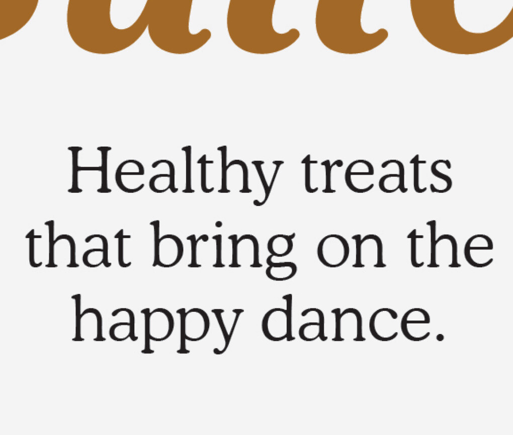
Our simple but thoroughly considered editorial tells the story of the happy dance and articulates the brand’s commitment to healthy, pure ingredients.
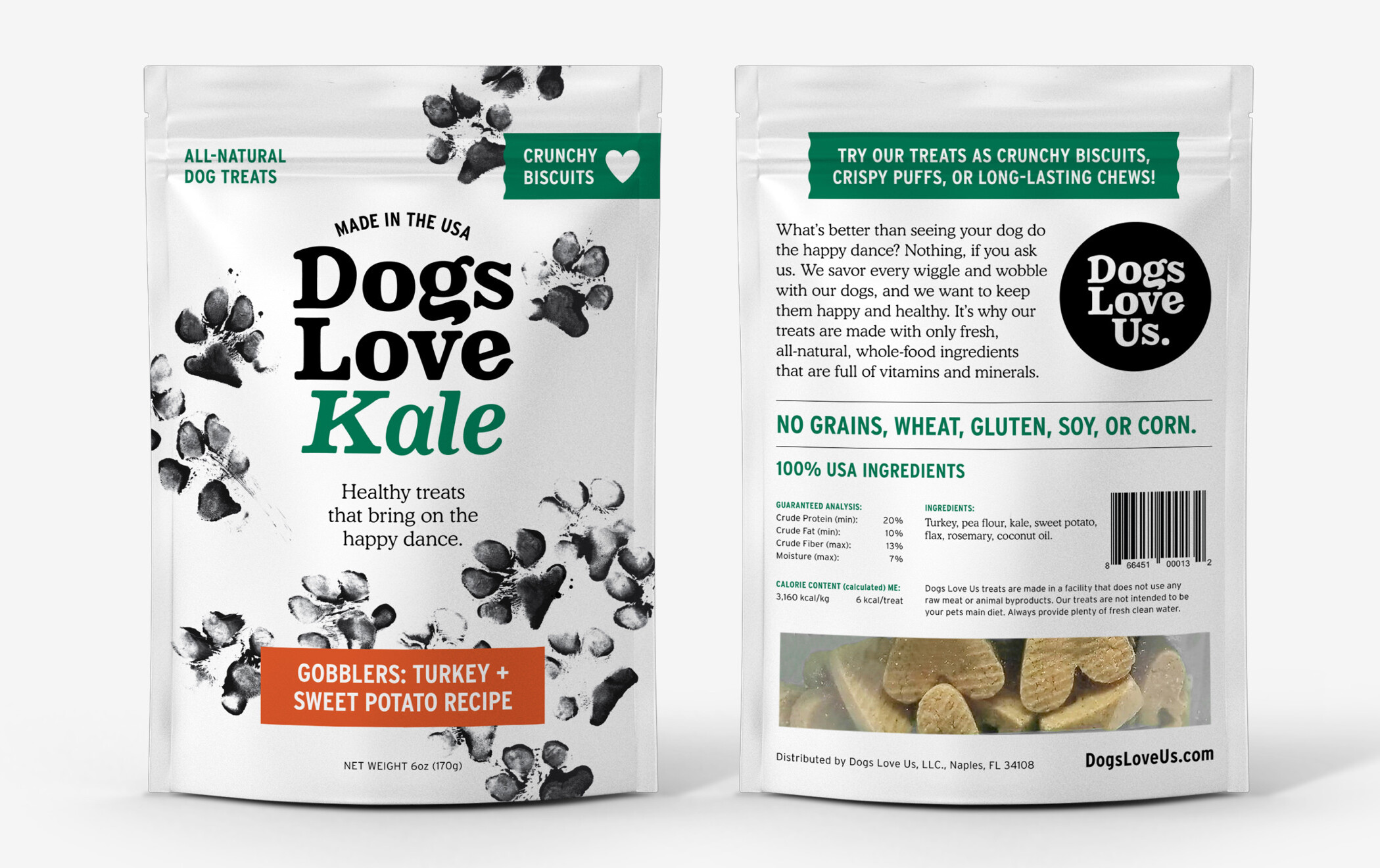
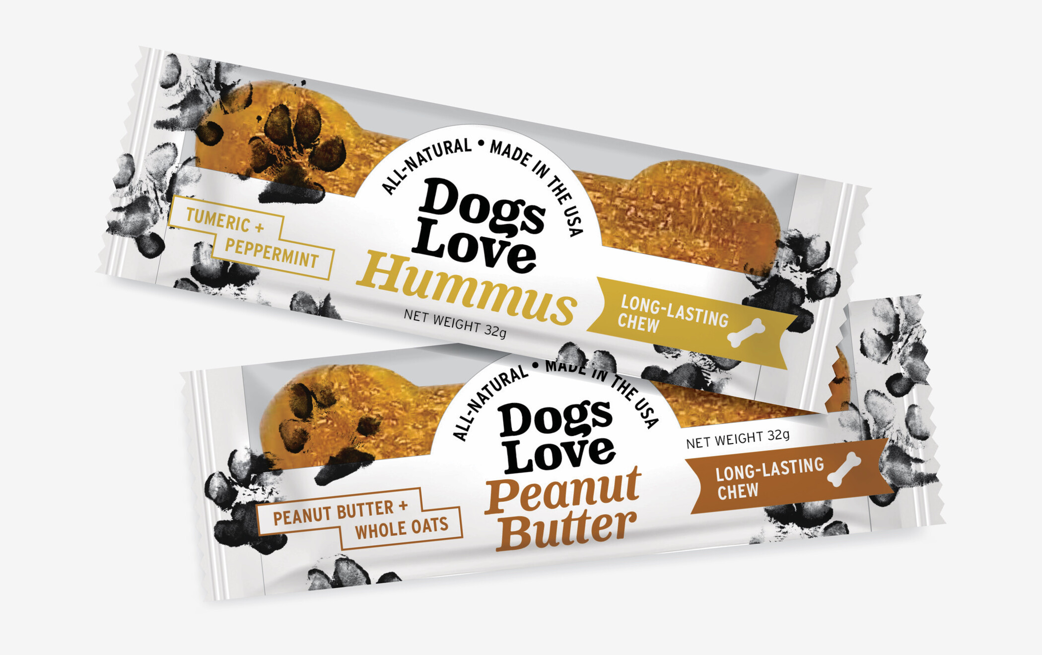
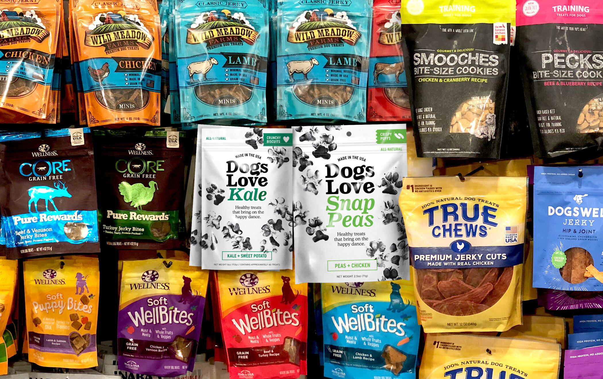
Most dog treat brands opt for saturated color schemes in bright or earthy hues. Our strategy was to differentiate the Dogs Love Us packaging with a bright-white, clean canvas. The packages stand out well in retail, underscore the all-natural message, and allow the unique flavors and happy dance paw illustrations to pop.
Just one year after jumping into his eventual owner’s open car door as she attempted to help him out of oncoming traffic, Fred, homeless at the time, is now a working illustrator working from his Vermont studio barn.