Brett Traylor is a 30-year veteran of the creative industry who currently operates Brett S. Traylor Creative Direction & Design, or Bst. for short. There, he directs a multi-disciplinary team on a variety of branding, naming, and design projects for clients such as Newark Liberty Terminal A.
Brett spent 17 years at the boutique creative agency, Thinkso, which he co-founded in 2006. There, he led the agency as executive creative director and co-created Give a Brand!®, the agency’s annual pro-bono branding event which donated over a half million dollars in branding services during that time.
Notable projects at Thinkso include the rebrand of Am Law100 firm Haynes Boone; naming and branding for DoResearch, Stanford University’s first online research portal; product naming and brand identity for the S’well water bottle; and publication design for Baylor College of Medicine. Other clients included The New York Times, Mount Sinai, Sesame Workshop, WineDirect, Duke Department of Medicine, Cadwalader, and Allstate.
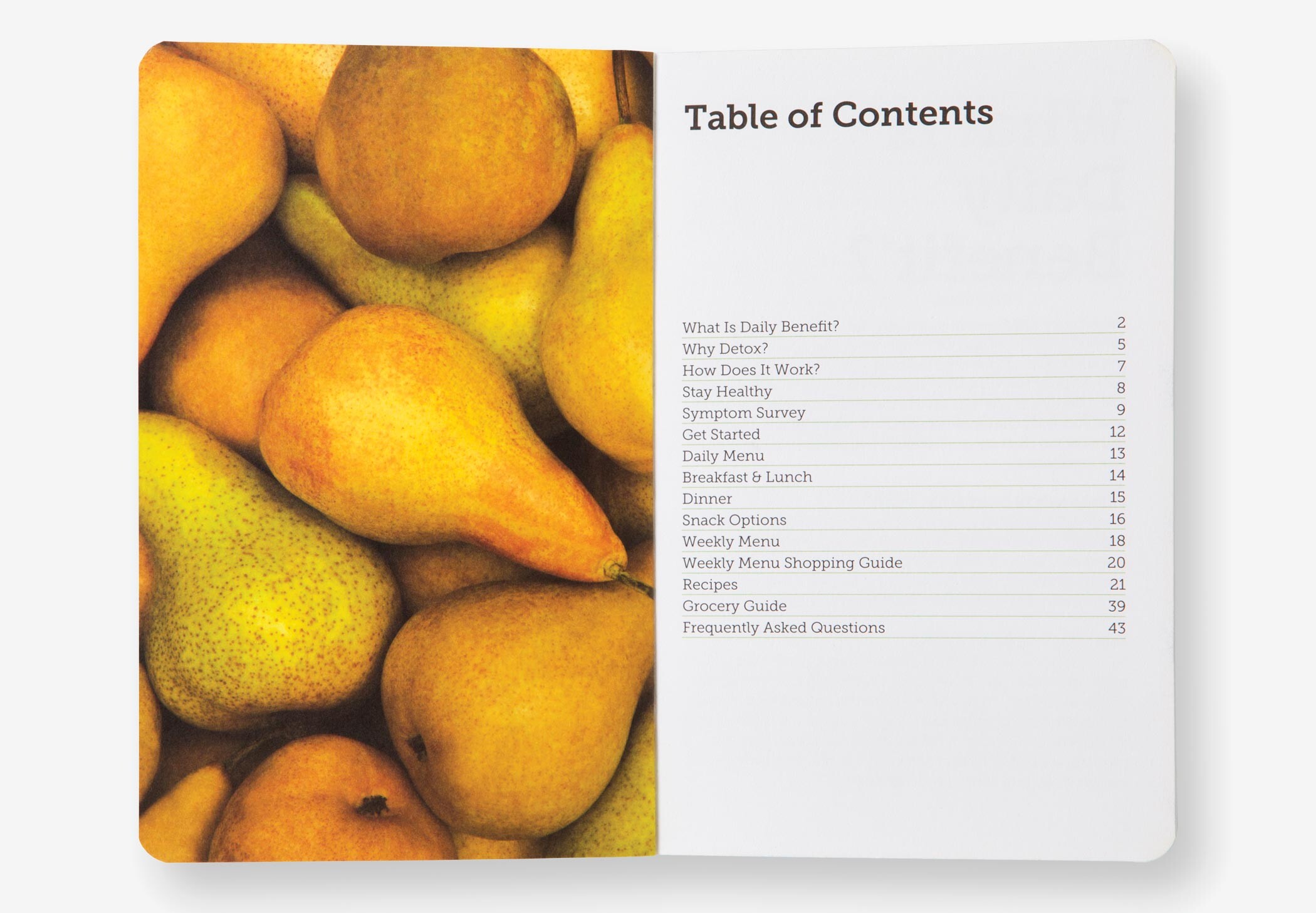
Prior to founding Thinkso, Brett spent eight years as part of Team Bierut at the international design consultancy, Pentagram, where he was elected associate partner in 2003. There, he created high-profile brand identities and design programs for clients such as the March of Dimes, the New York Jets, Elvis Presley Enterprises, Princeton University Athletics, United Airlines, and the Harley-Davidson Museum.
Brett’s work is included in the permanent collection of SFMoMA and has garnered awards from the American Institute of Graphic Arts, the Society for Experiential Graphic Design, the Art Directors Club of New York, Communication Arts, D&AD, the Financial Communications Society, and REBRAND 100. He was also named one of the 50 most influential graphic designers by Graphic Design USA in 2013.
His work has been widely acclaimed in publications such as Print, Creative Review, Wired, Metropolis, and The New York Times—and he has contributed to a range of articles and books. Brett frequently lectures on design at Rutgers University, Pratt Institute, the School of Visual Arts, and ArtCenter College of Design.
Brett holds a BFA in graphic design from Brigham Young University. He has two grown daughters, three pit bull rescues, and an assortment of chickens—most of whom reside at his home in southwest Vermont.
