NYLAG
Brett led this project during his 17-year tenure as Thinkso’s founder and executive creative director.
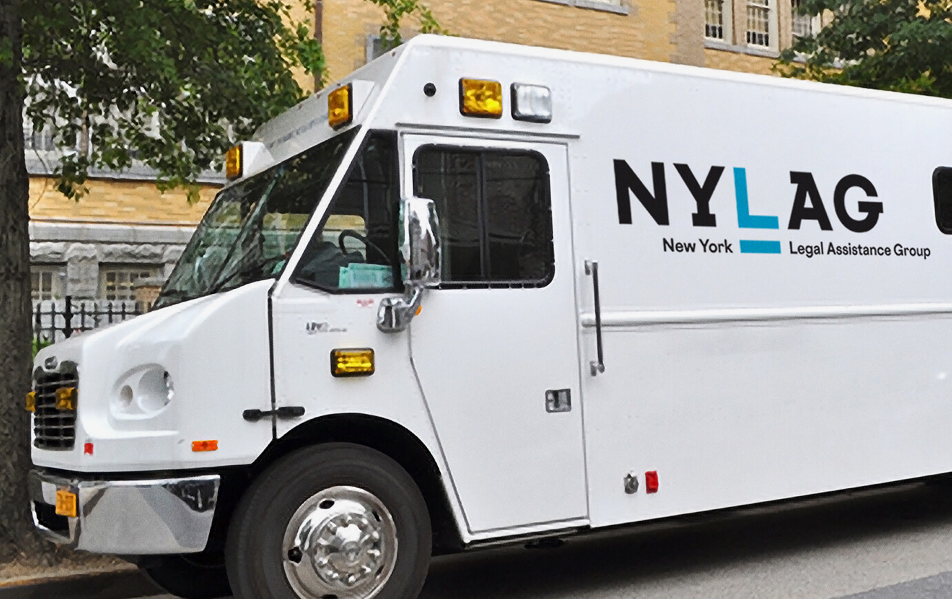
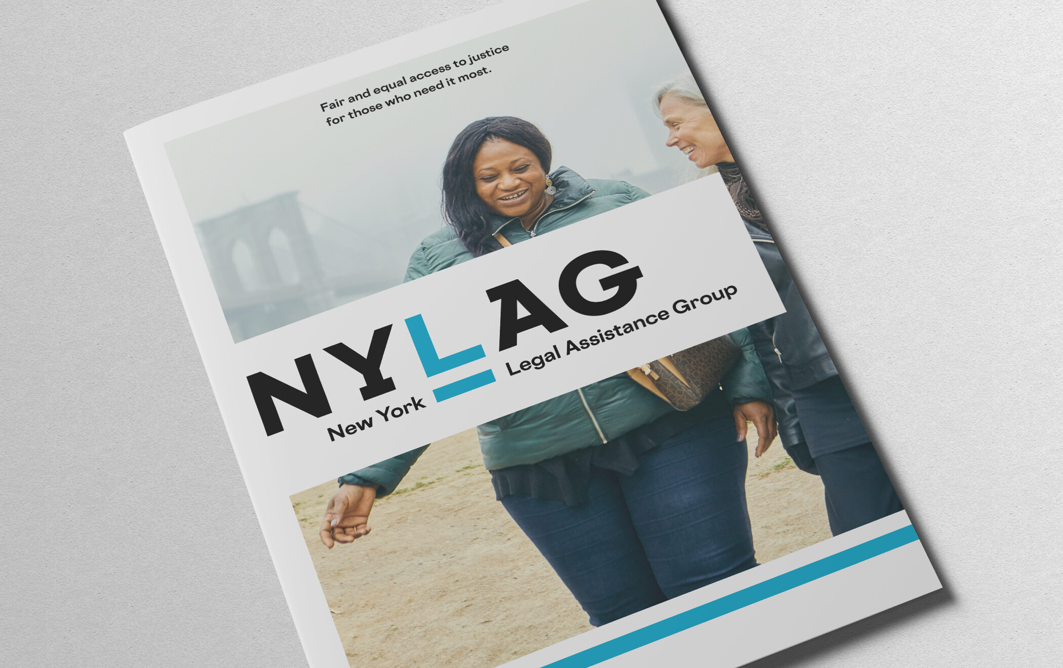
The New York Legal Assistance Group provides free legal services to people in poverty. We designed a crisp, modern logotype with an underscored L standing for “equality under the law” — something that everyone is entitled to. We created an overview brochure, corporate stationery, a brand style guide, and a treatment for their 30th anniversary celebration.
The NYLAG people are the definition of passionate do-gooders. It was really satisfying to give them something that fit their style, budget, and ambition.
The logotype features custom-drawn monoweight letterforms meant to exude strength and forward progress. The underscored L highlights the organization’s dedication to the idea of equality under the law and introduces a graphic motif that can be extended throughout the visual system. It also creates a comfortable way to spell out the full acronym. To emphasize change and modernity, we replaced the dated burgundy red of their old identity with a bright, energetic blue.
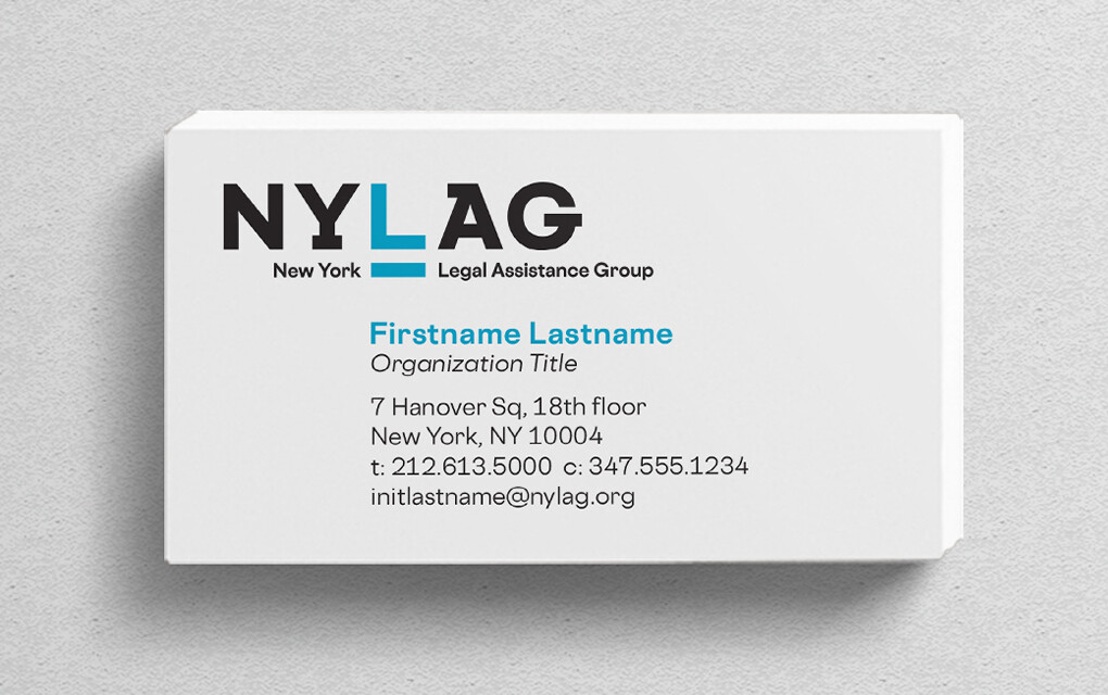
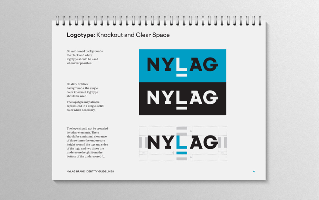
We applied the new branding to stationery, designed treatments for sub-branded programs, and developed a simple guideline document to help NYLAG further implement their new identity.
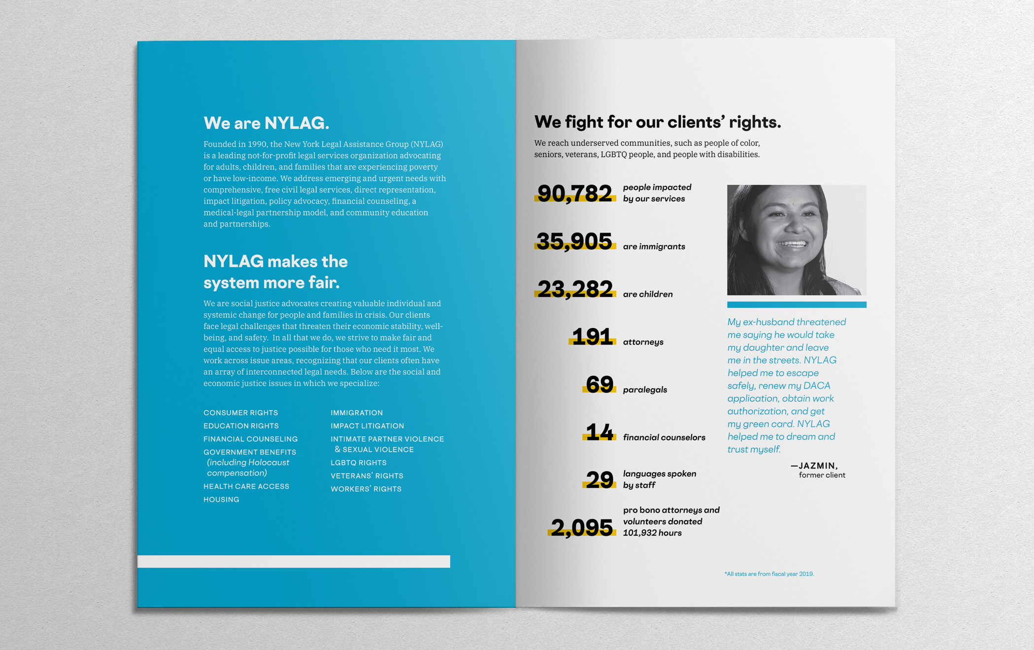
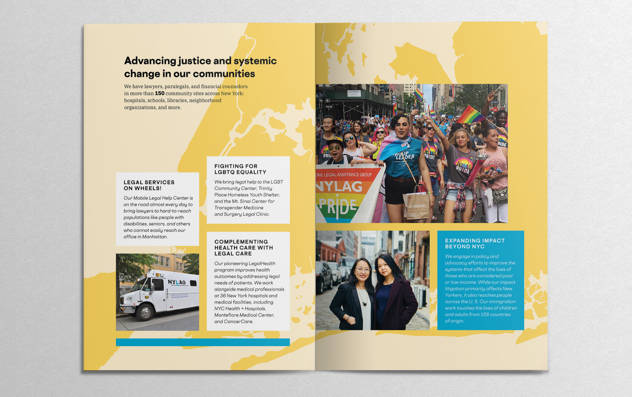
We created a print brochure that provides an overview of the organization, highlighting their practice areas, programs and client stories. The underscore is used to give emphasis to NYLAG’s impressive statistics, while the visual framework as a whole is designed to work well with imagery and other content generated by a variety of sources.