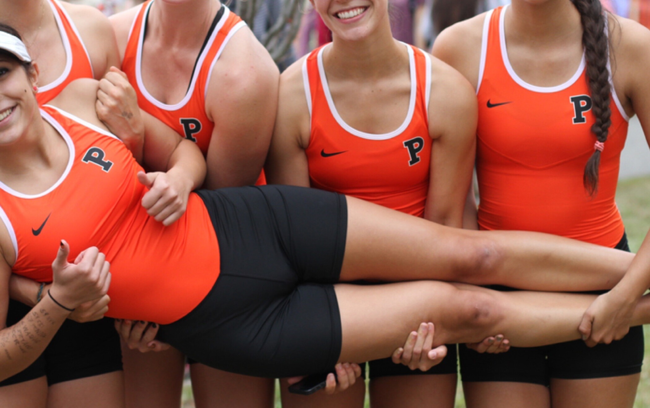
Princeton University Athletics
Brett completed this project during his time as associate partner on Team Bierut at Pentagram.
We developed a flexible and sophisticated brand identity for Princeton University Athletics — one of the country’s oldest and most prestigious collegiate programs. Instead of gimmicky cartoon characters, Princeton’s Tiger is represented by a series of four confidently posed silhouettes inspired by sculptures found across their idyllic campus.
People forget that the Ivy League was instituted to grow interest in college sports at its advent in the 1930s. So even though Princeton is now much better known for academics, it has an amazing athletics legacy. In fact, almost 1 in 5 undergraduate students play a varsity sport at Princeton.
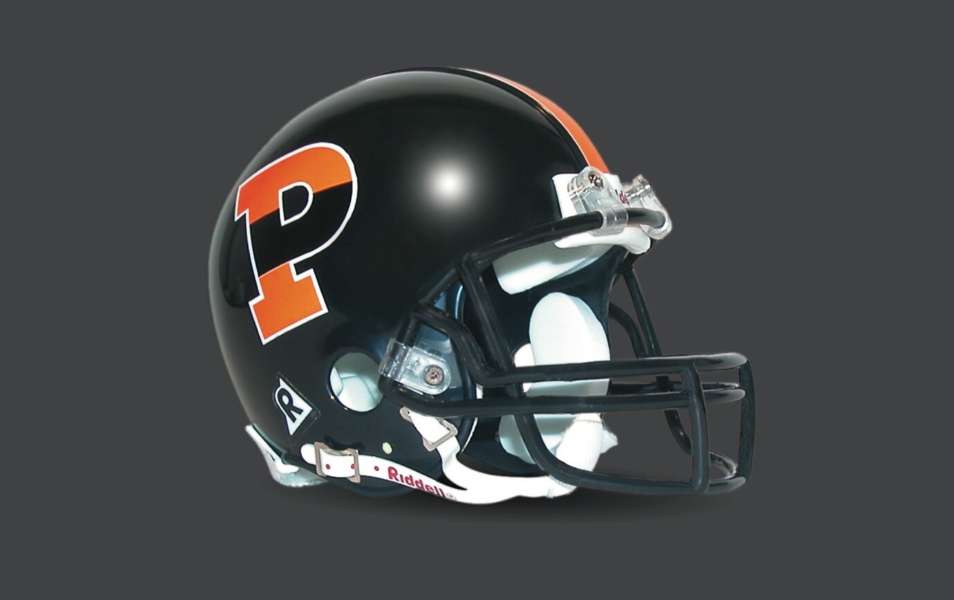
After more than 125 years, Princeton finally got its very own “P”. Although it may not sound like much, having Penn as an Ivy League rival can make things confusing. The custom-drawn letterform is distinctive, solid, and comes in a variety of colors and patterns, including tiger stripes.
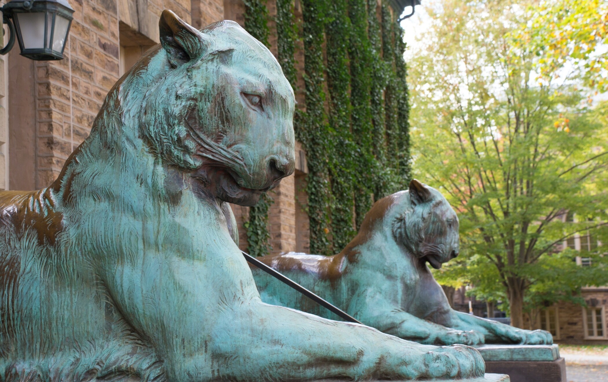
Eschewing the modern, cartoonish approach to college mascots, we introduced a series of four confidently posed silhouettes, inspired by familiar sculptures.
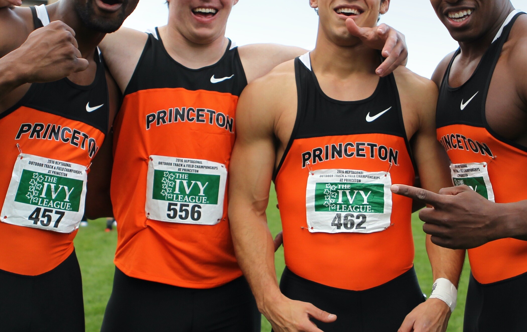
Emphasizing legibility, strength, and simplicity, the Princeton name is set in an all-caps sans-serif font. To add variety, arched and outlined options were also introduced. The logotype can be modified to represent the school in general, or a specific sport or team.
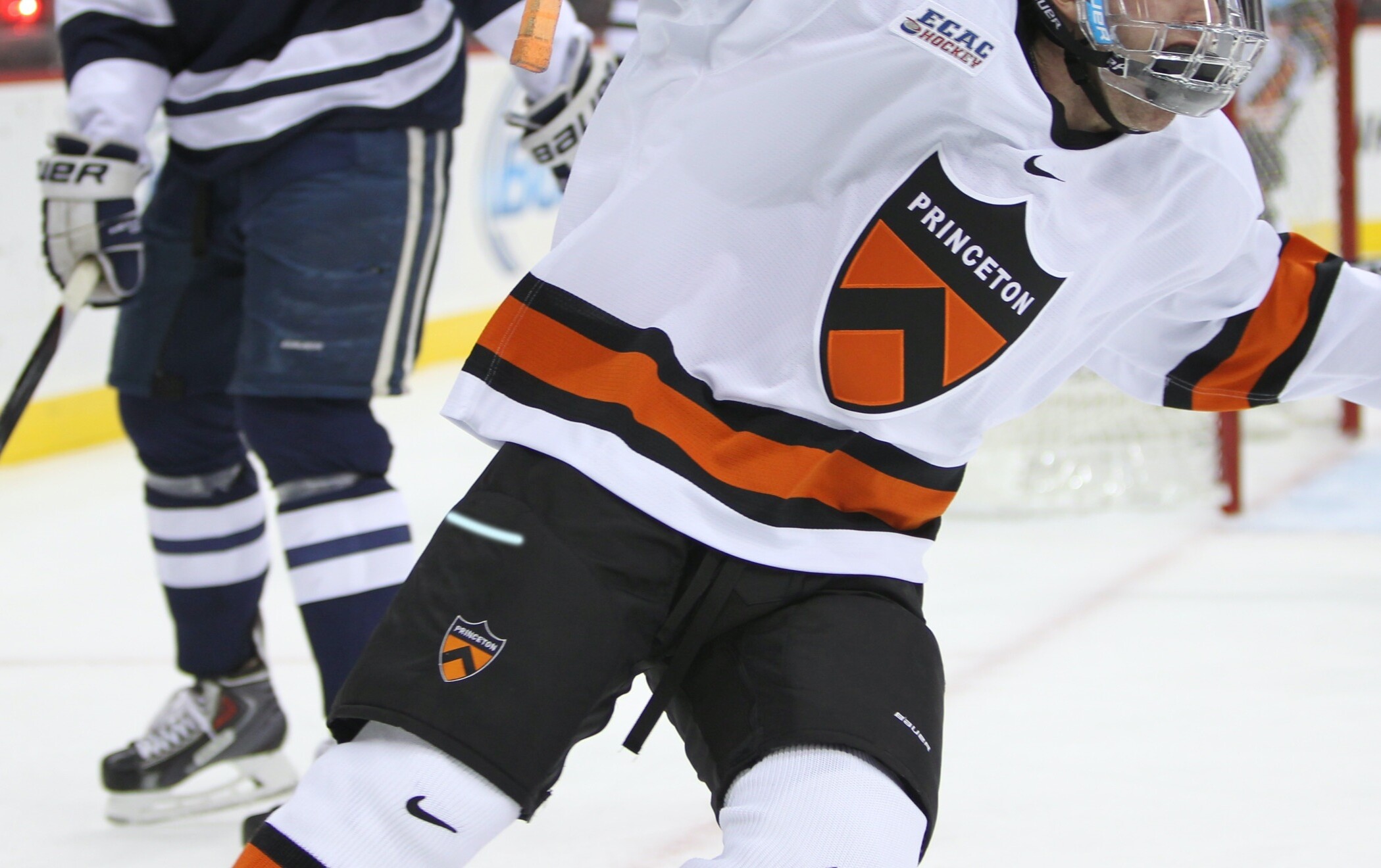
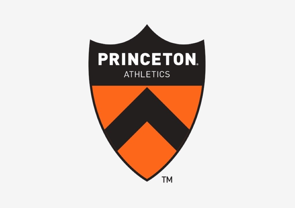
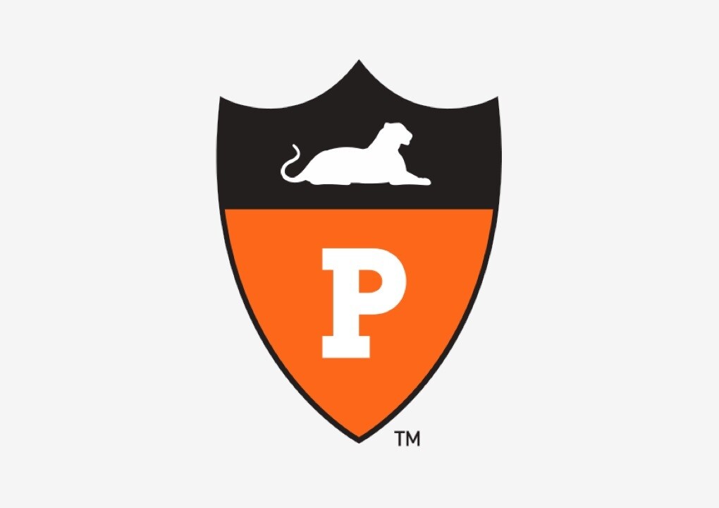
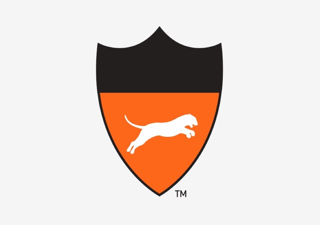
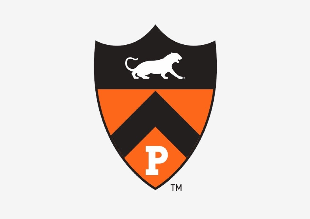
Like many Ivy League schools, and academia in general, Princeton University uses a shield as one of its identifiers. Within the athletics identity, the classic shield was redrawn and modified to accept the full range of iconography, including the “P”, the logotype, and the tiger silhouettes. This provides individual sports and teams with another means for distinguishing themselves while still staying true to the program overall.