Duke Department of Medicine
Brett led this project during his 17-year tenure as Thinkso’s founder and executive creative director.
Duke University’s Department of Medicine enlisted us to create a distinct look for its communications. We introduced an abbreviated logotype, a distinctive photographic “wallpaper” motif, and a new, signature teal color. With that in place, we rolled out a sharply appointed alumni report, digital newsletter templates, and a detailed style guide.

It can be a real challenge to create communications that do justice to an institution like Duke University, but the team was able to infuse vibrancy and life into our communications while still honoring the gravity of our work.

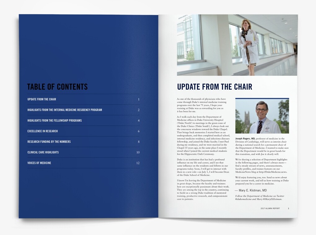
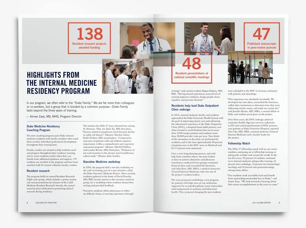
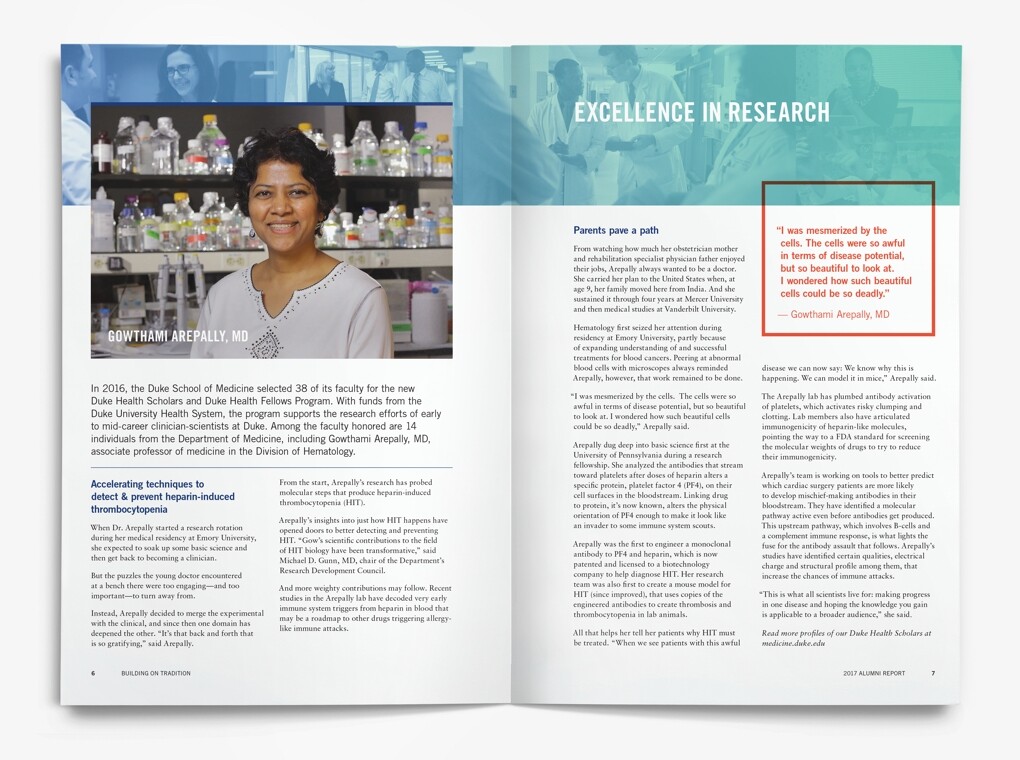
Together with the department’s communications team, we articulated “faces, names, and stories” as the focus for the new communications framework. The Alumni Report was the first item produced in the new scheme. The cover features generous use of the wallpaper treatment, the signature teal color, and the retooled departmental logo. Interiors show how these elements may flexibly be combined in different ways.
We revised the logotype by shortening “Department” to “Dept,” freeing up valuable space. We then anchored it within the “brand space” along with other important publication information to help orient the user. The result was a snappier and more polished appearance that conveys authority and understated elegance.
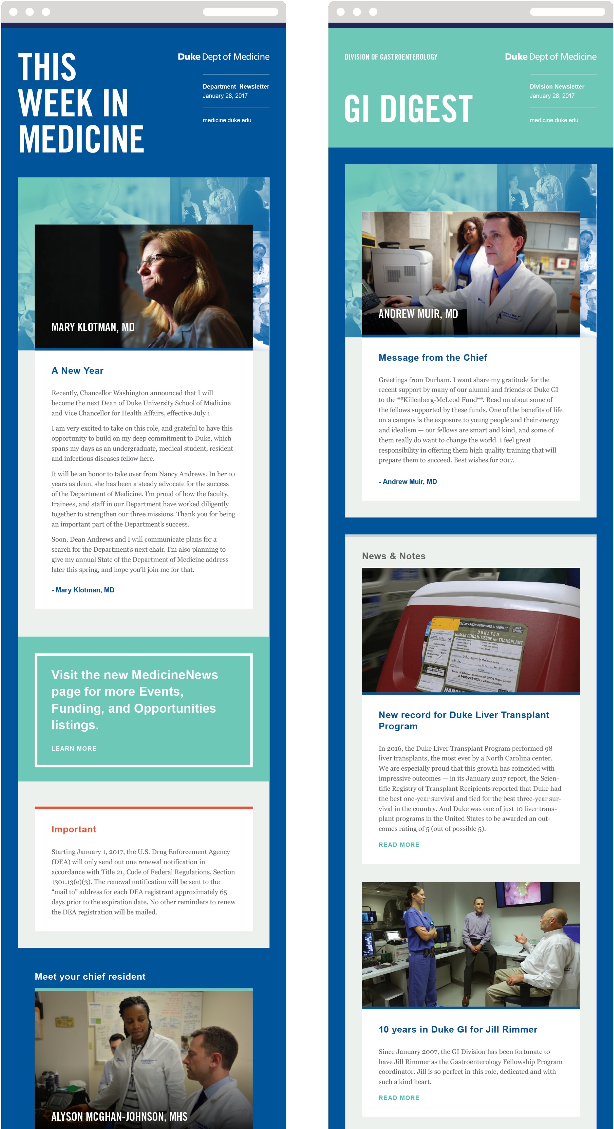
Enewsletters were a core deliverable of the project. While using the same component styles, headers can be swapped in and out of the responsive templates depending on whether the publication is being sent by the department or one of its 12+ divisions. Some newsletters had distinctive names of varying lengths. Others were very straightforward and descriptive. We designed the template to accommodate them all.

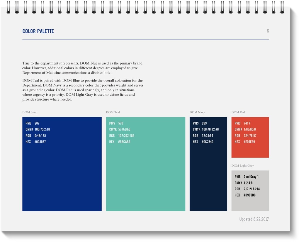
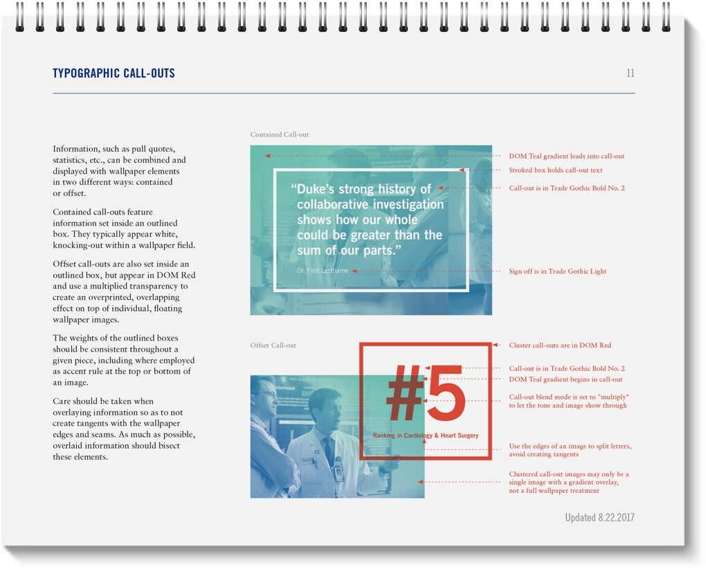
To codify the system, we created a style guide that could be used by internal and external groups to create materials within the new system. Specifications were laid out for type, color, and imagery—for both print and digital applications.