Max Courage
Brett led this project during his 17-year tenure as Thinkso’s founder and executive creative director.
For Give a Brand! 2015, we took on the Max Warburg Courage Curriculum, named after a young boy who died of leukemia at age 11. The organization stresses reading and literacy in young people as a way to promote courage and confidence in themselves. Looking to broaden the organization’s reach and improve its impact, we redesigned its identity, website, and marketing collateral.
We shortened the organization’s name to "Max Courage," which references “maximum” transformation and honors Max Warburg for being the superhero-like inspiration that he is.
A huge part of the rebrand was adopting a new DBA. We cut the name down to two words that capture the spirit of the organization: Max Courage.
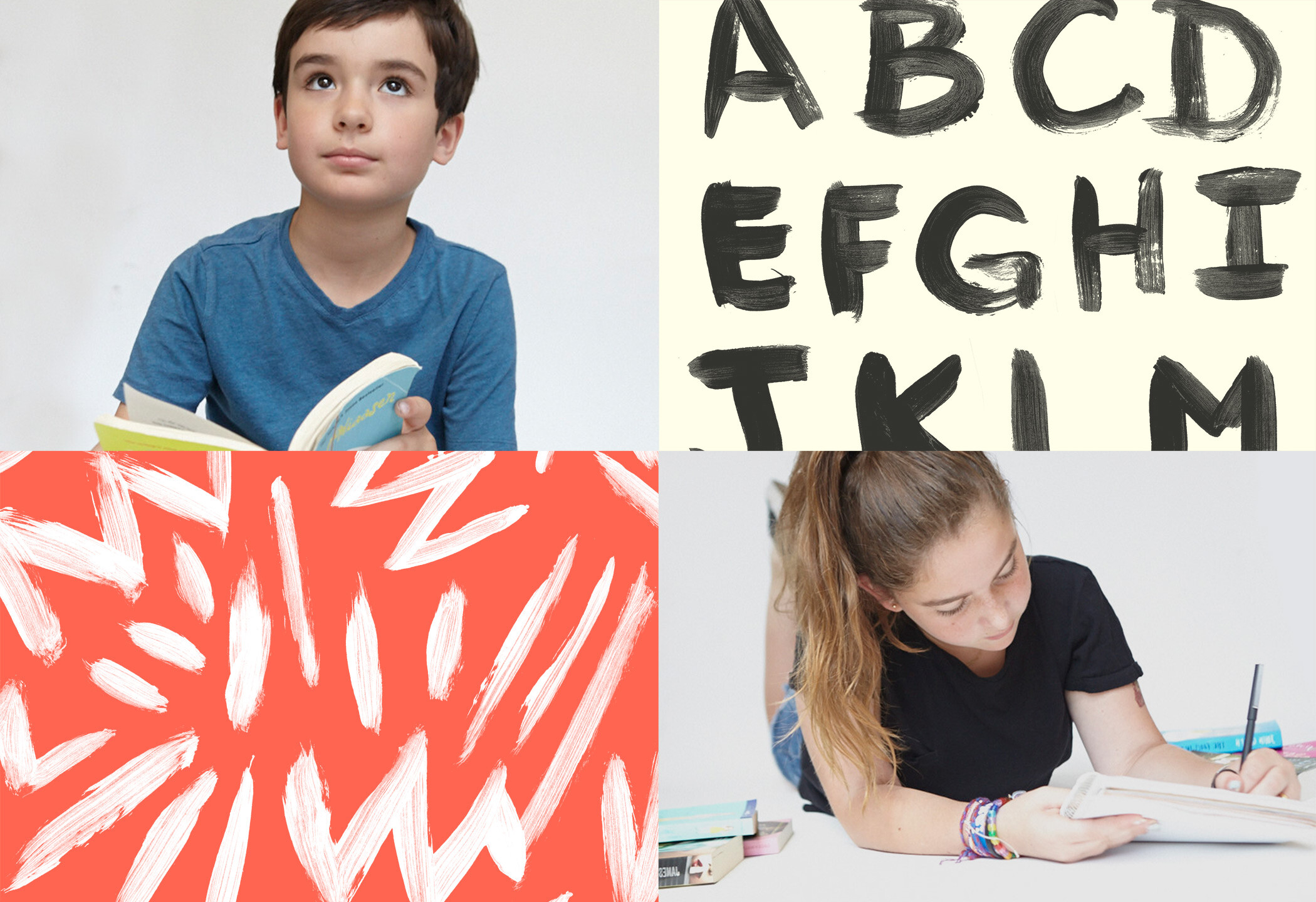
Images of children reading establish a focal point for the marketing collateral. In turn, those same children helped create the patterns and hand-painted typography that became key graphic elements of the identity.
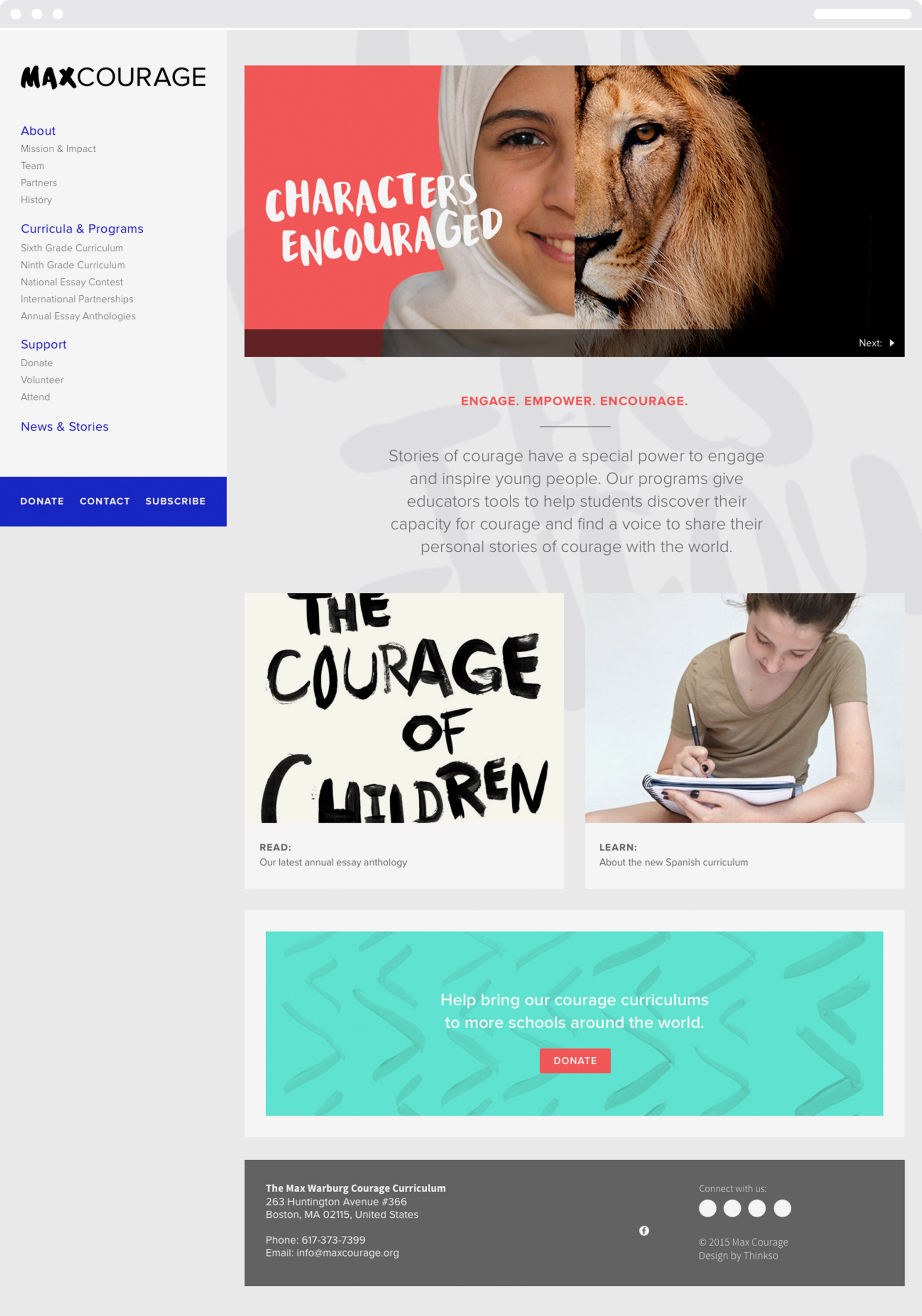
We designed a clean, highly functional website that completely reorganized Max Courage's online content.
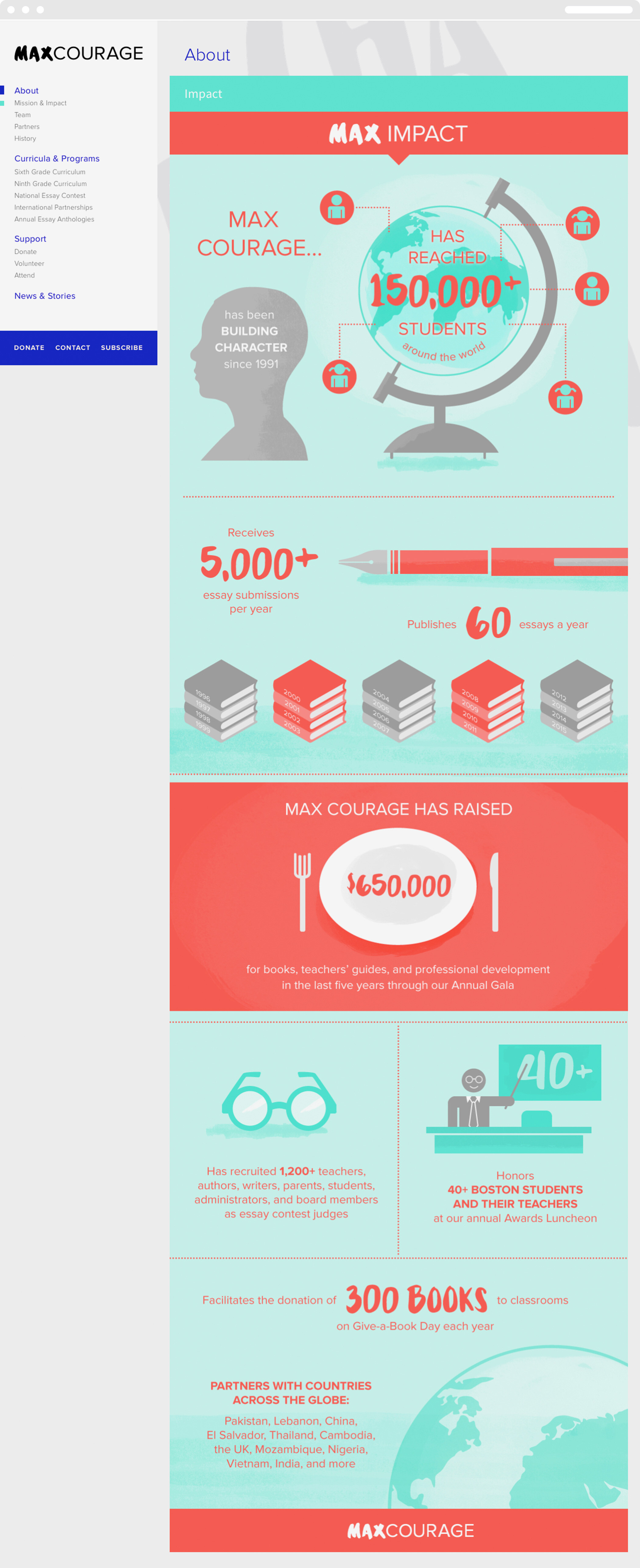
Textbook-like iconography and Max Courage identity elements are used as an overall visual approach to distilling information, presenting statistics, and engaging readers.
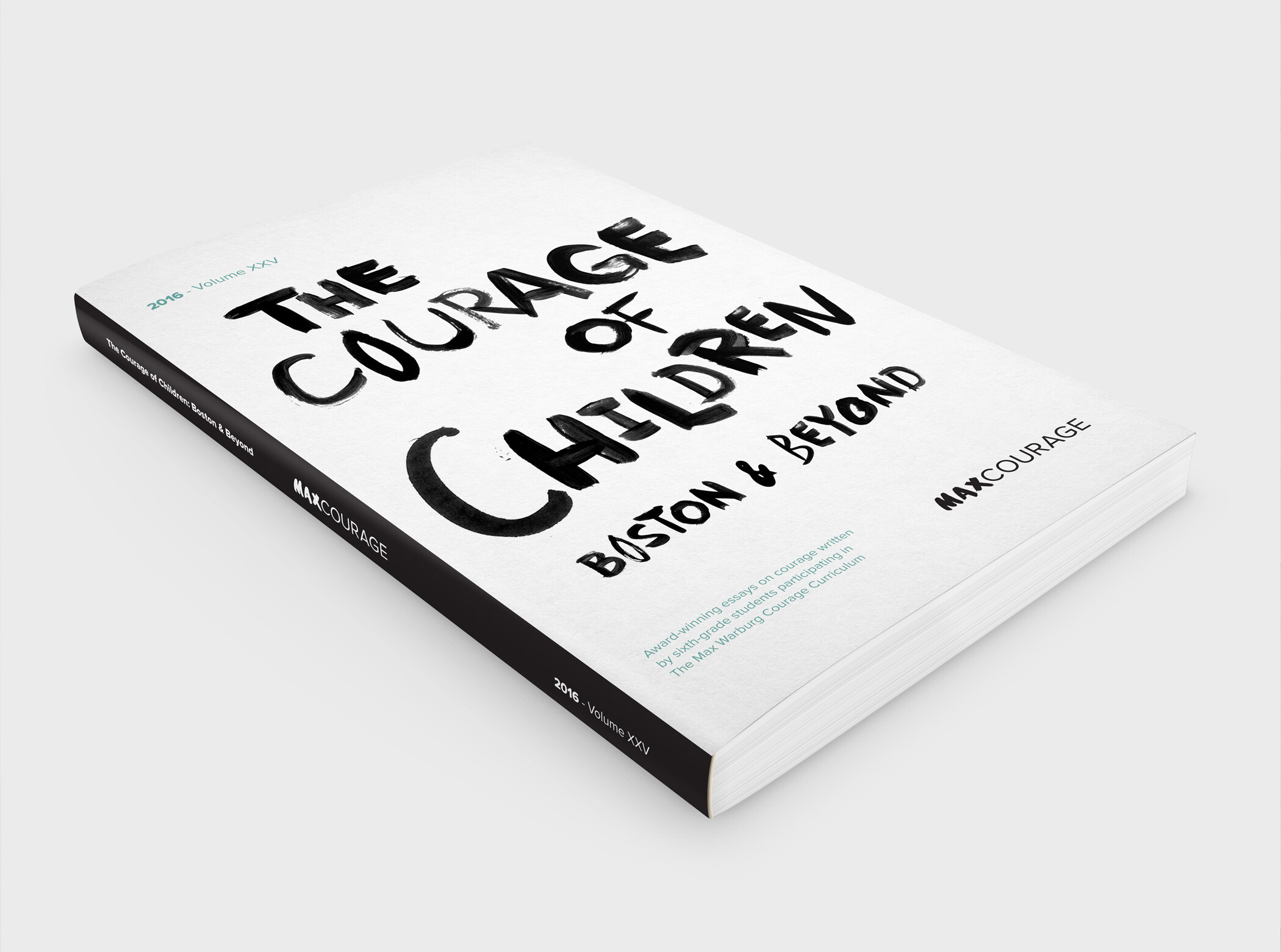
We redesigned the book cover for The Courage of Children: Boston and Beyond
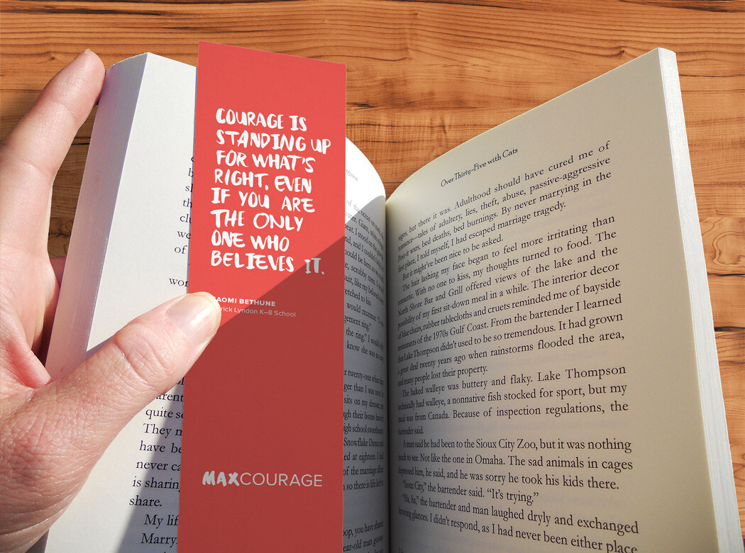
Simple, inexpensive bookmark giveaways were created in multiple colors and feature courage-related quotes from students.
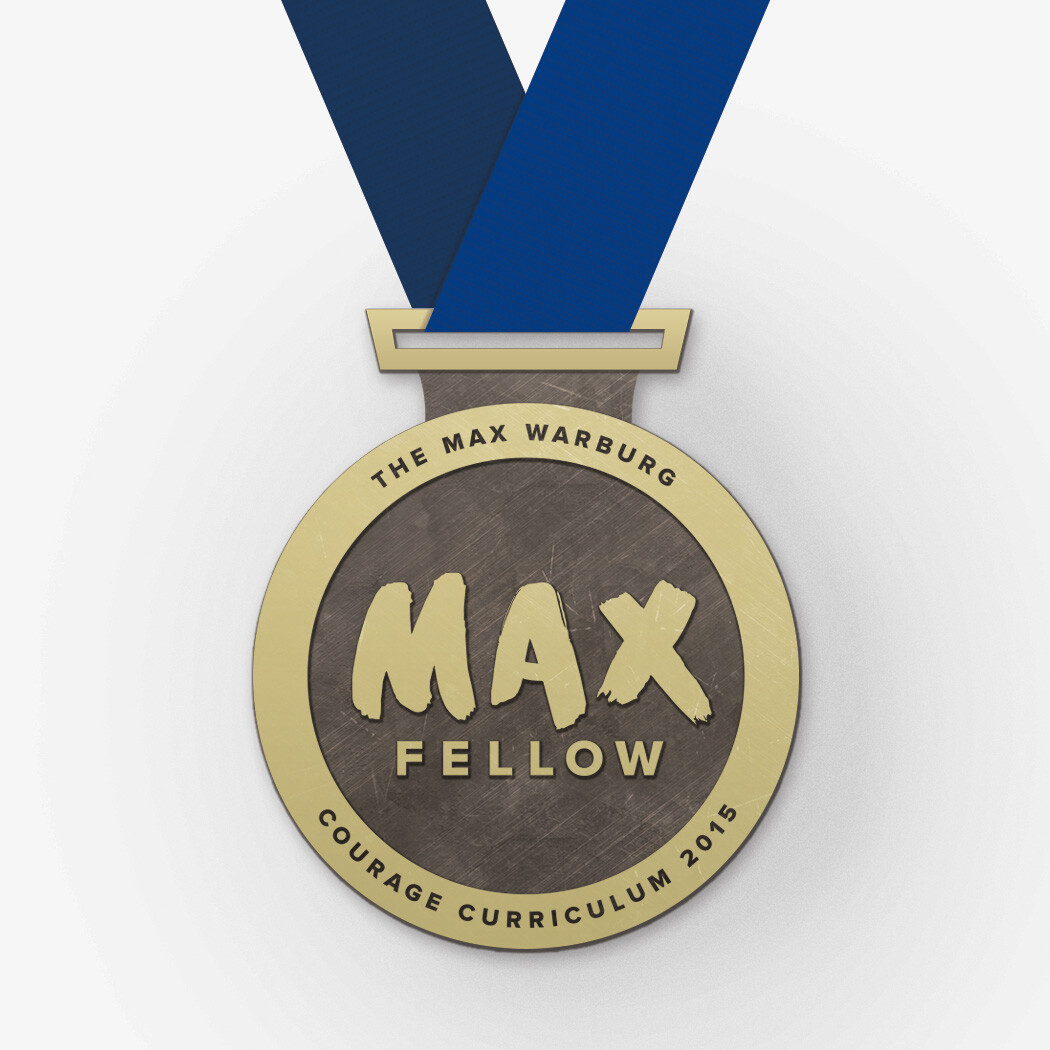
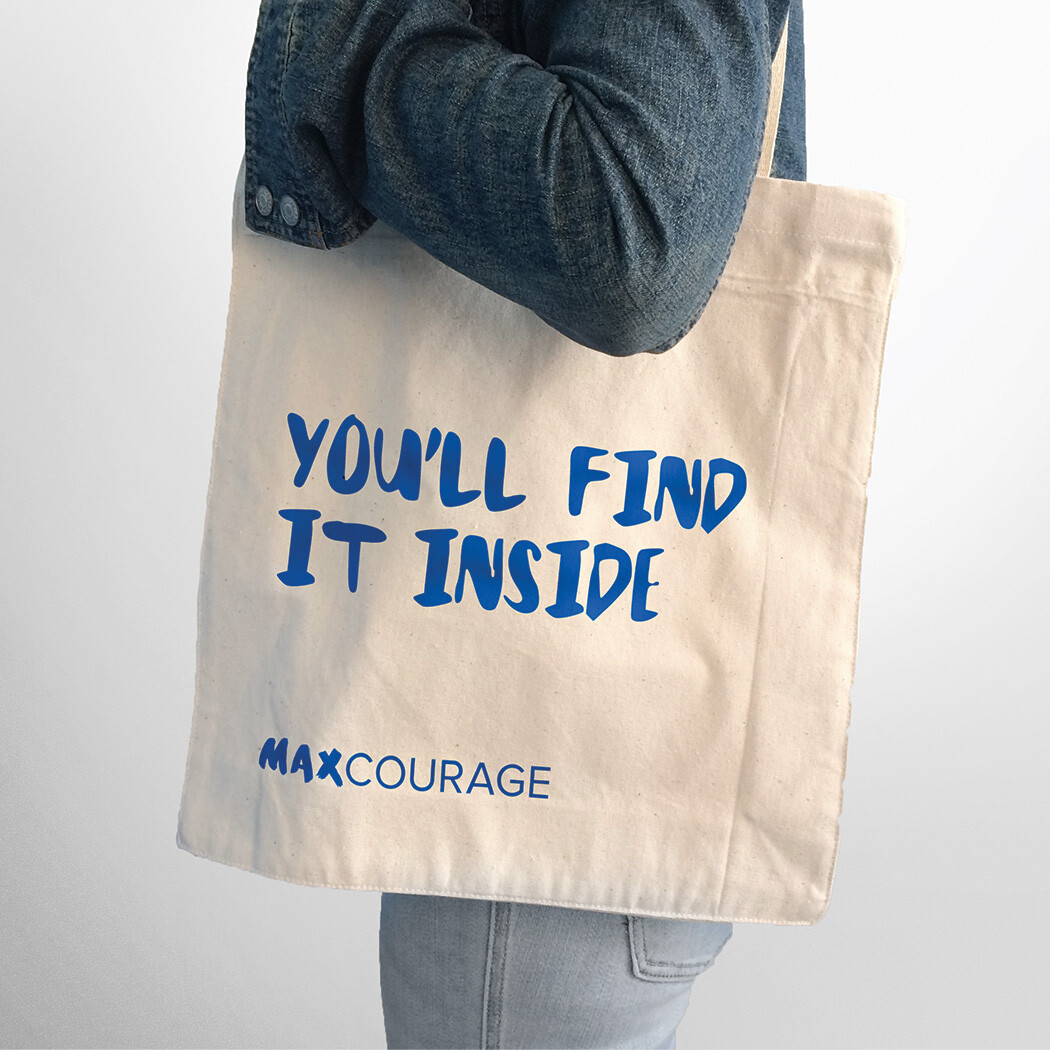
We redesigned the Max Fellow medal to better reflect the achievement it represents. The treatment of the name also established a model for sub-branding. The tote bag combines “Max Courage” with clever editorial to create messaging that’s both literal and inspirational.
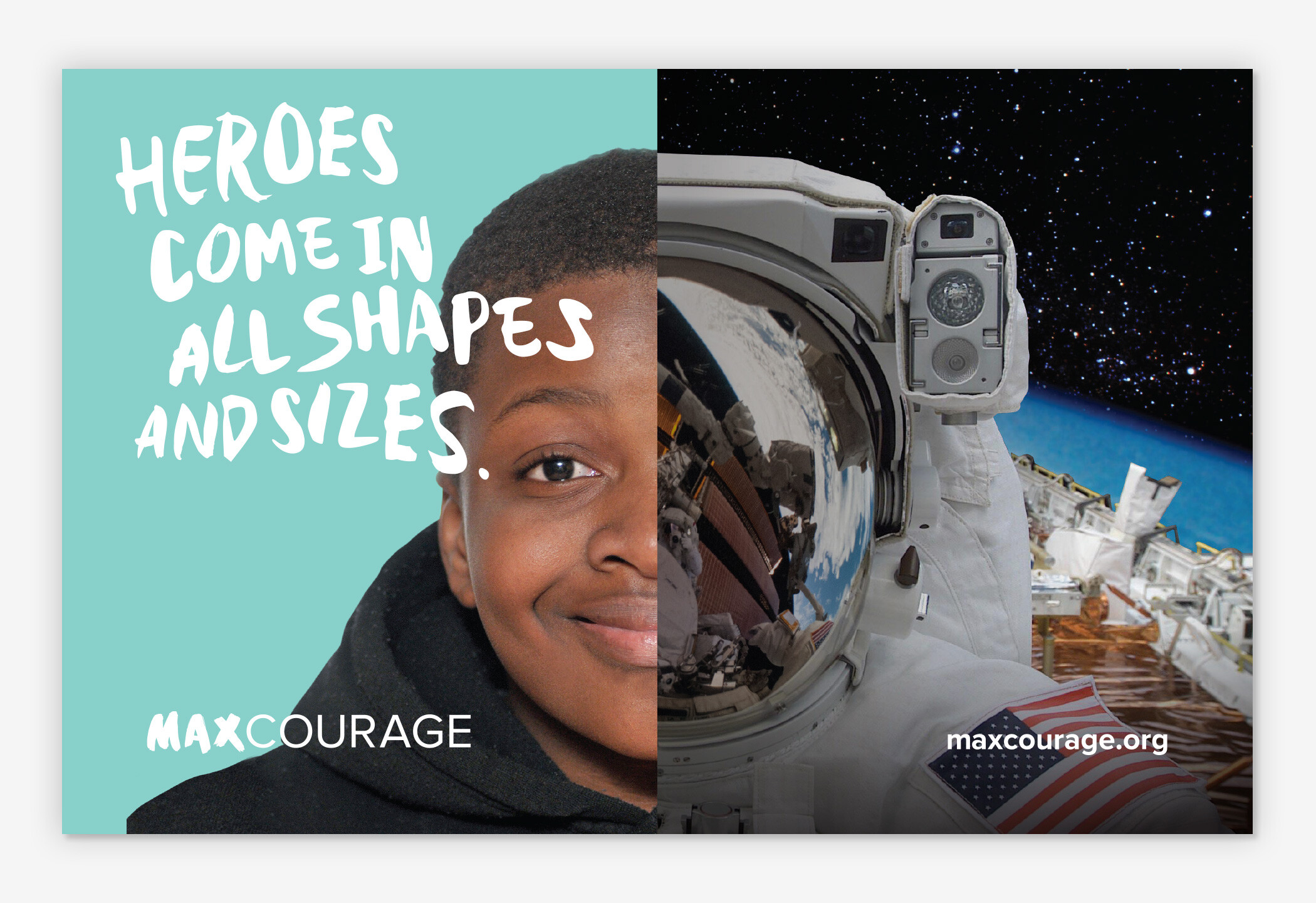
A series of split-screen photo illustrations pair children’s faces with characters from literature to underscore the power of literature in the development of personal courage.
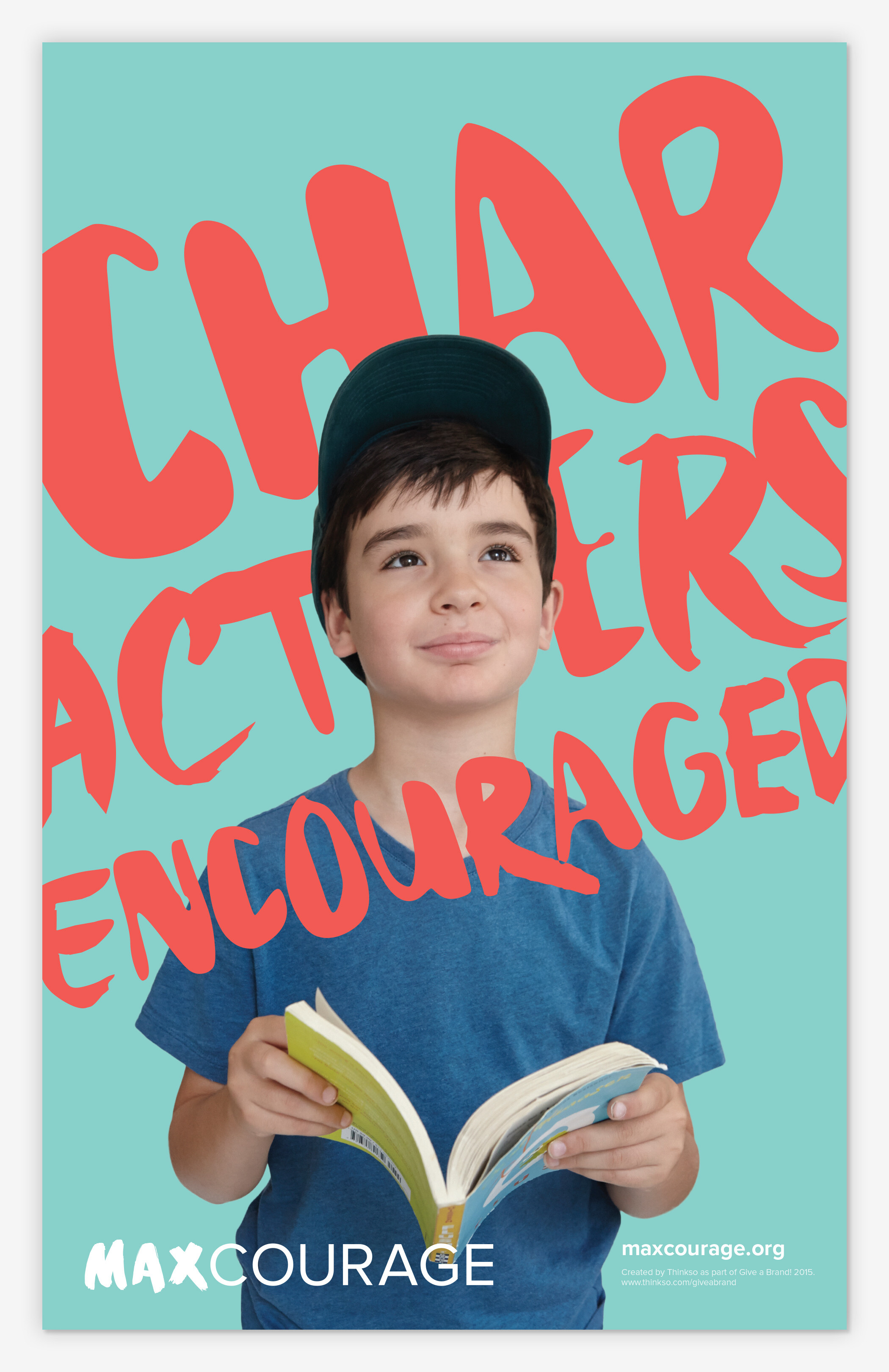
The overview brochure includes program information and unfolds to reveal a poster that boldly displays the organization’s new tagline, “Characters encouraged.”