NJCAHT
Brett led this project during his 17-year tenure as Thinkso’s founder and executive creative director.
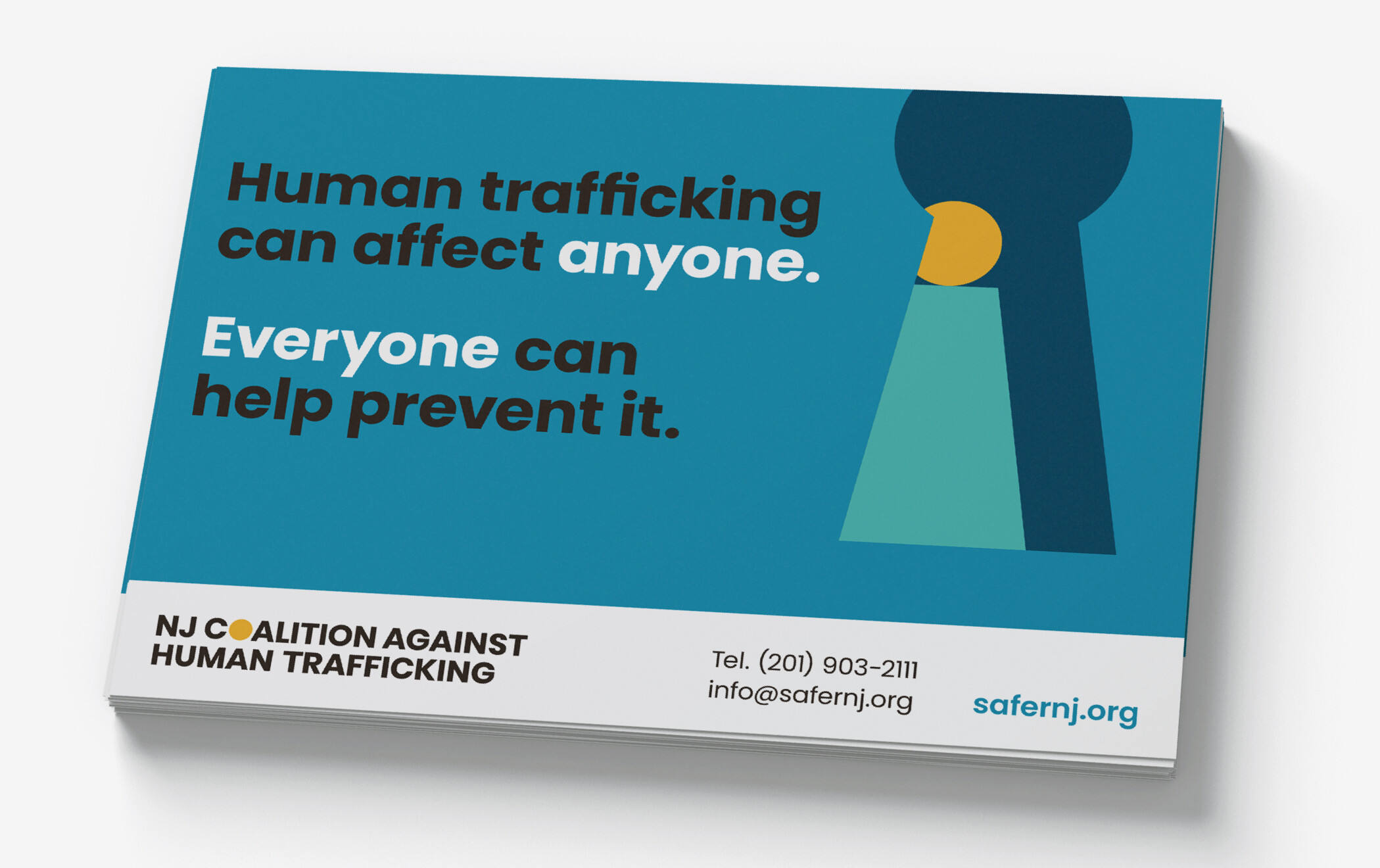
The New Jersey Coalition Against Human Trafficking brings together communities from across the Garden State for events, outreach, seminars and sharing of resources to combat the sinister crime. We created a broad range of tools to spread the word and do the work — such as brand identity, website, messaging, postcards, brochures, t‑shirts, event materials, and social media.
Our approach was to humanize a subject that, at its core, is all about humanity — and preserving and defending it. We created a visual identity that is warm, approachable, and that sidesteps the typical, misguided tropes of “modern-day slavery”, etc.
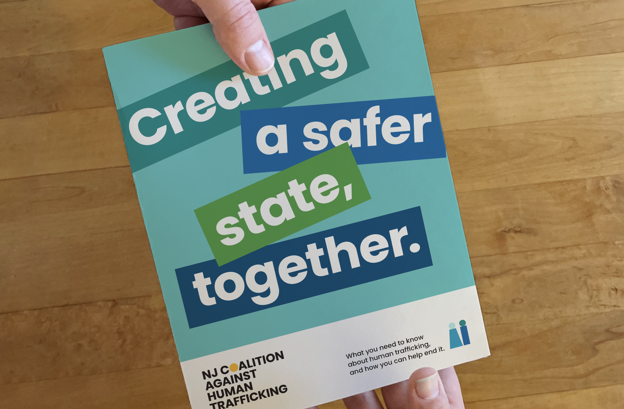
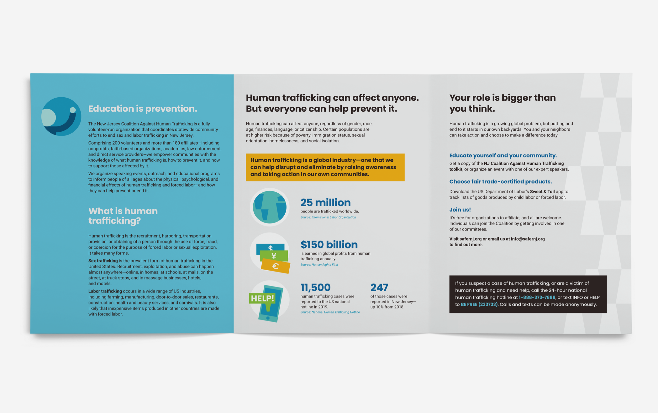
The educational brochure, “Creating a safer state together,” underscores the key terms, statistics, and facts related to human trafficking—and how community members can use NJCAHT as a resource for combatting the issue.
Using bold colors and symbols, the RED FLAGS postcard outlines the common signs that someone might be a victim of human trafficking as well as national resources anyone can use to call for help.
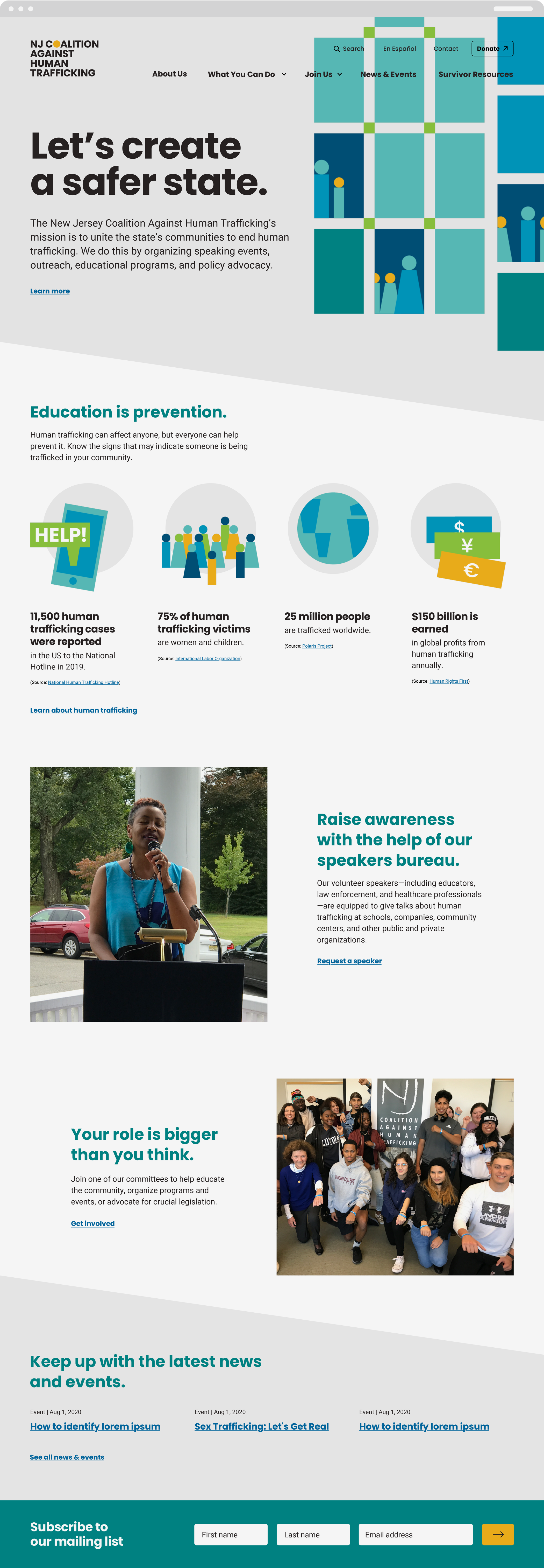
To help their content feel more accessible and professional, we streamlined NJCAHT’s website content by actions that people could take: learning about human trafficking, raising awareness, getting involved with the Coalition, and more.
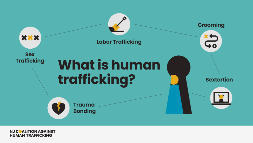
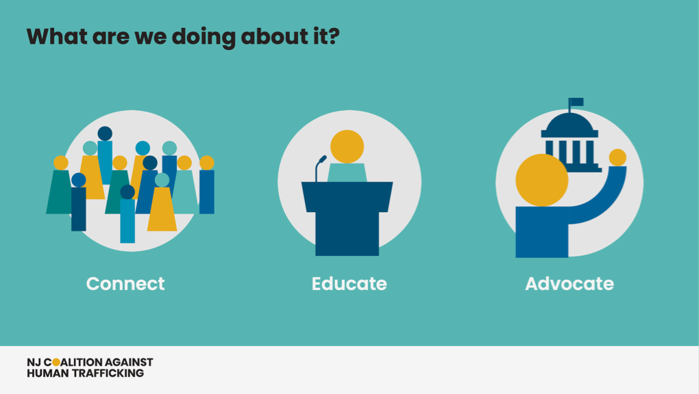
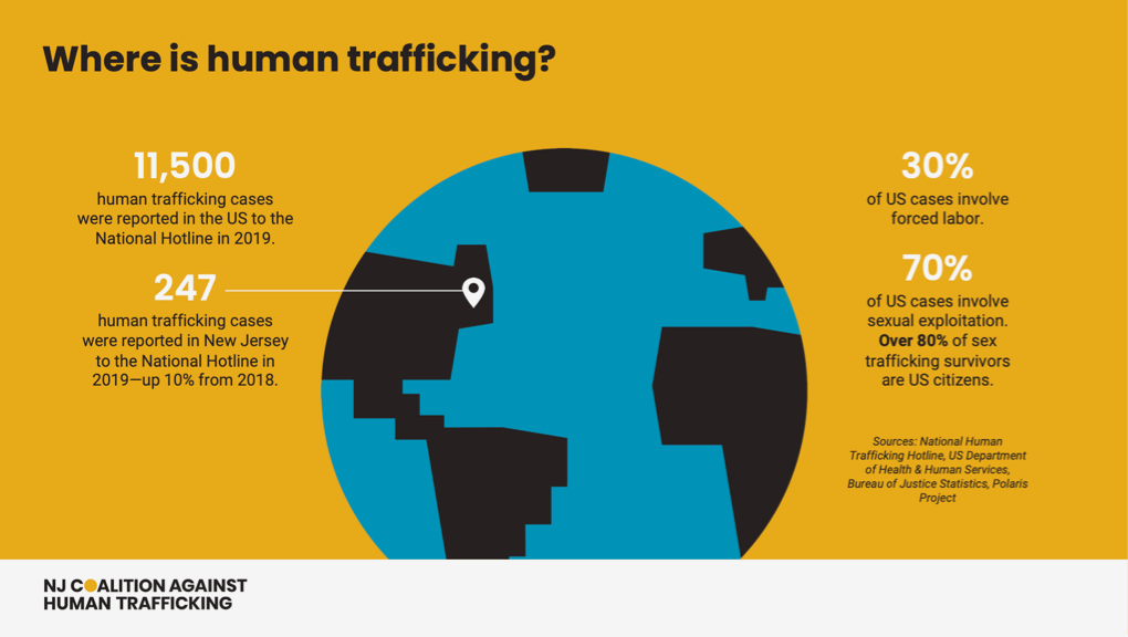
We wrote and designed a PowerPoint deck for the Coalition to use at speaking engagements that highlights the latest research about what and where human trafficking is, as well as the latest work from the Coalition to end human trafficking in New Jersey.
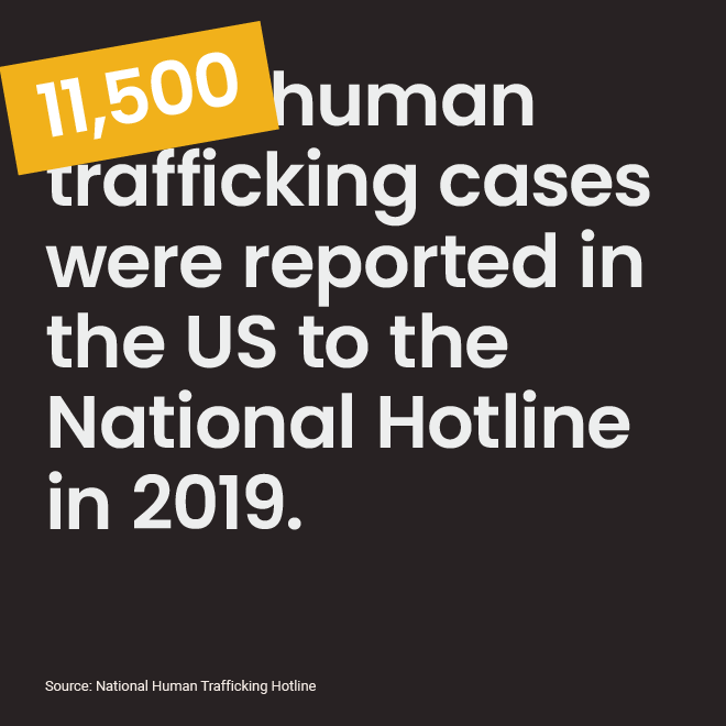
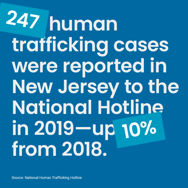
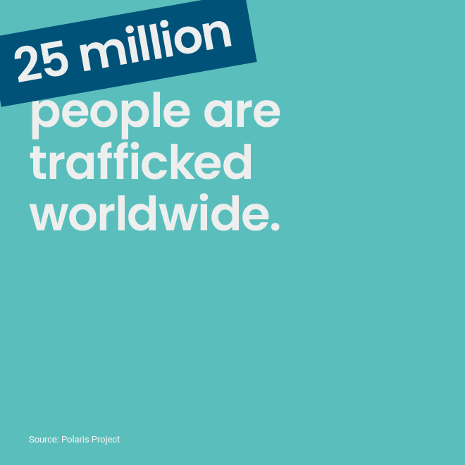
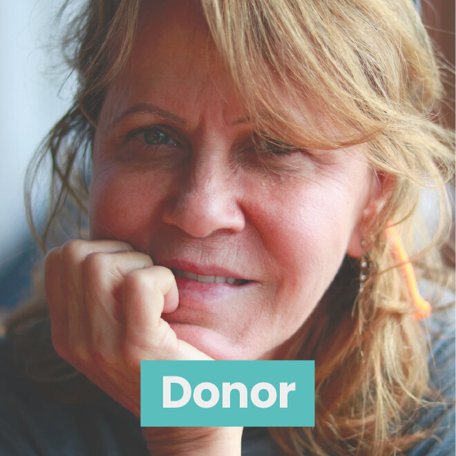

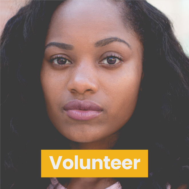
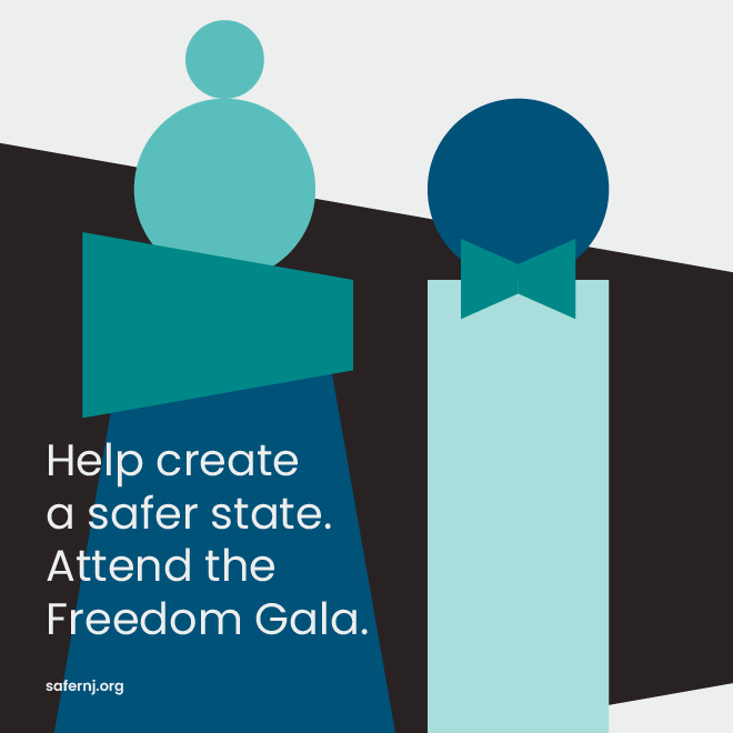
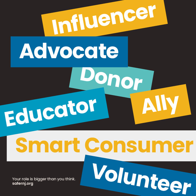
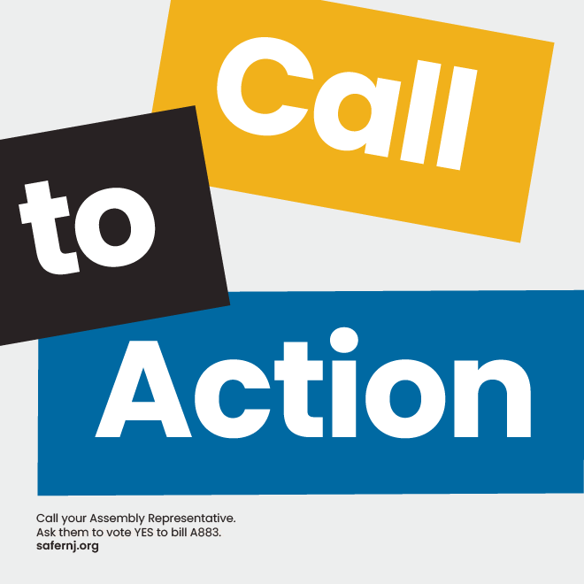
We created a suite of social media templates that could easily adapt to different types of content—including statistics, facts, quotes, and announcements—while still allowing NJCAHT to present itself and its work consistently on its Facebook, Instagram, Twitter, and LinkedIn channels.
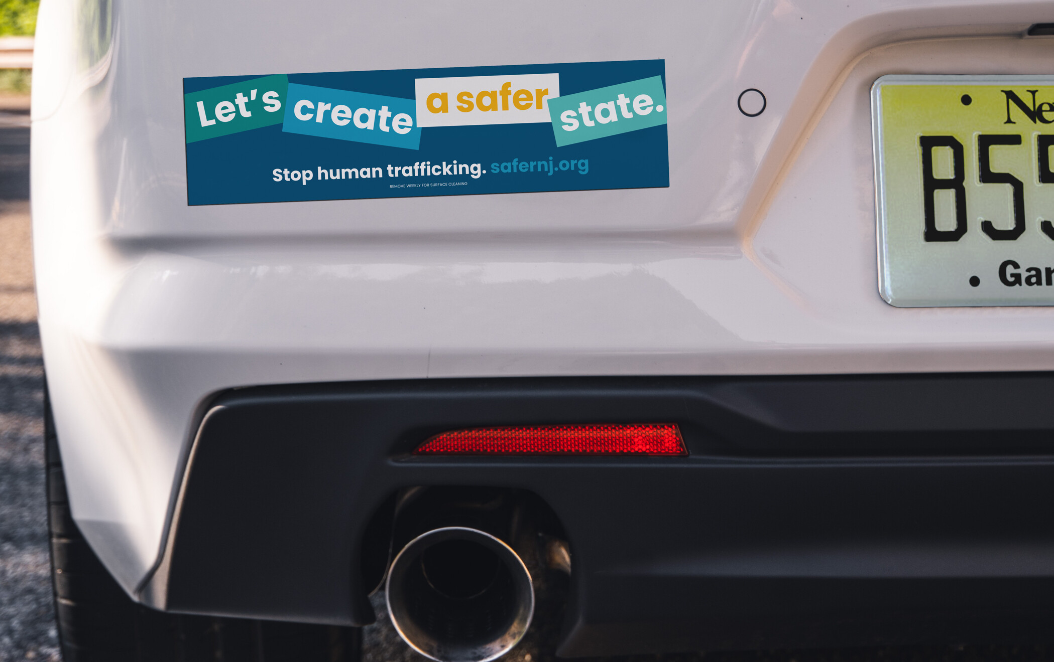
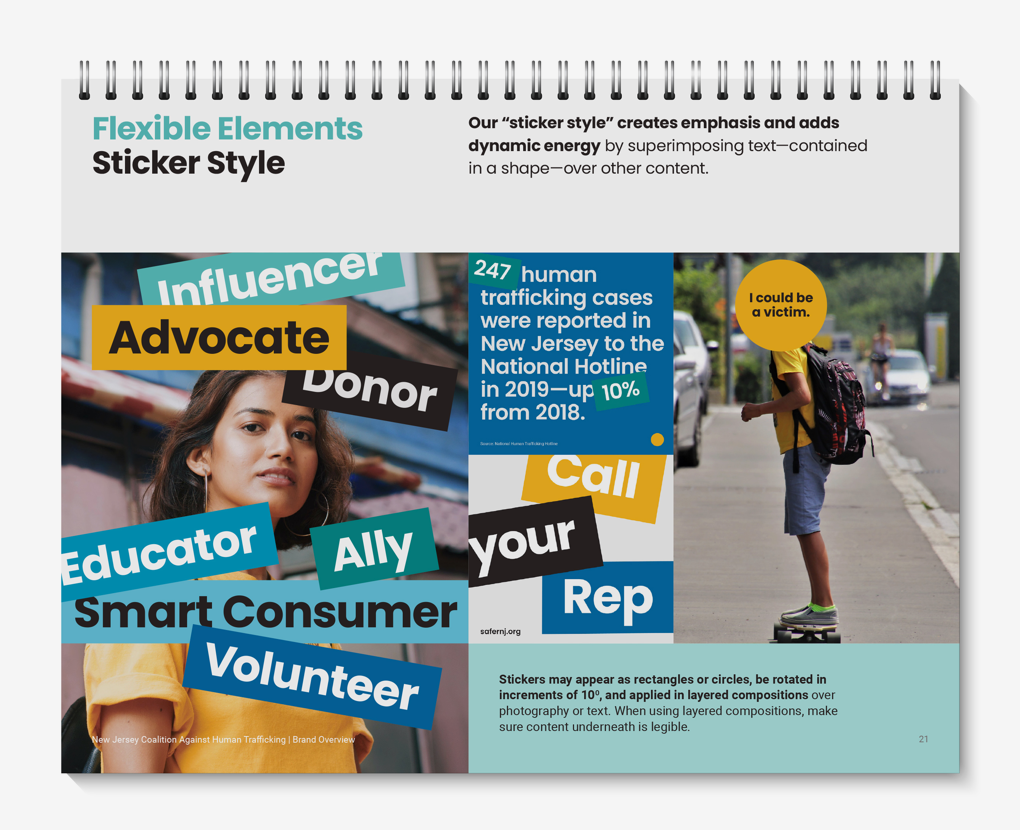
We applied punchy, dynamic layouts to text to further connect with the Coalition's audience. This "sticker style"—shown on this eye-catching car magnet—added energy, elevated the messaging, and aligned with younger audiences already engulfed in the sticker culture.
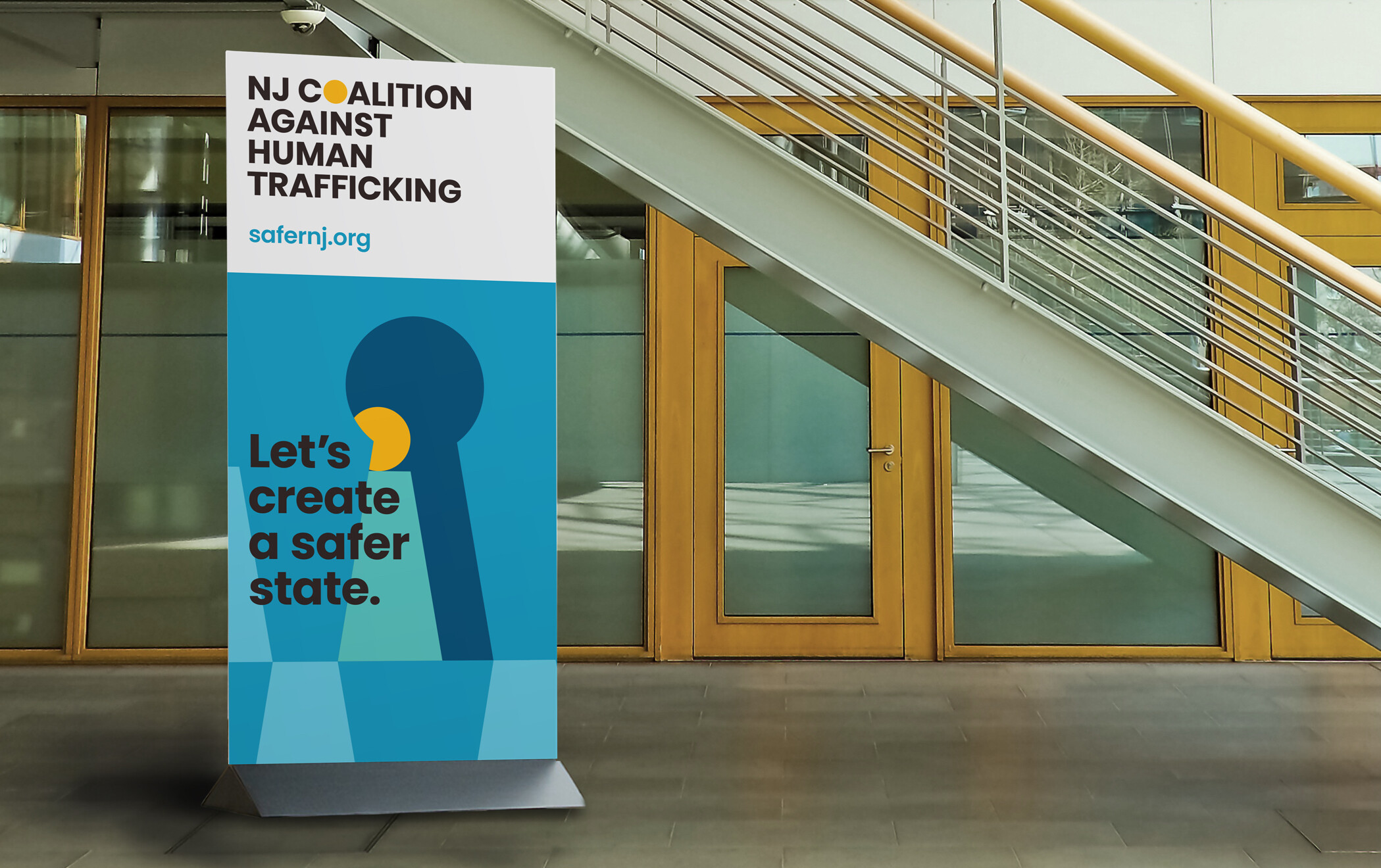
The vibrant pull-up banner helps the Coalition stand out in an approachable way at community events and presentations to the general public, potential donors, trauma responders, and community leaders.
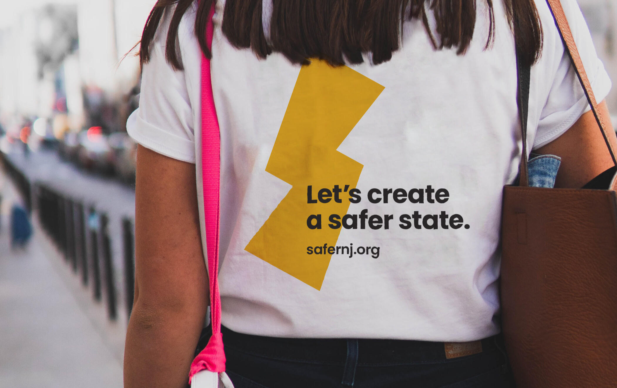
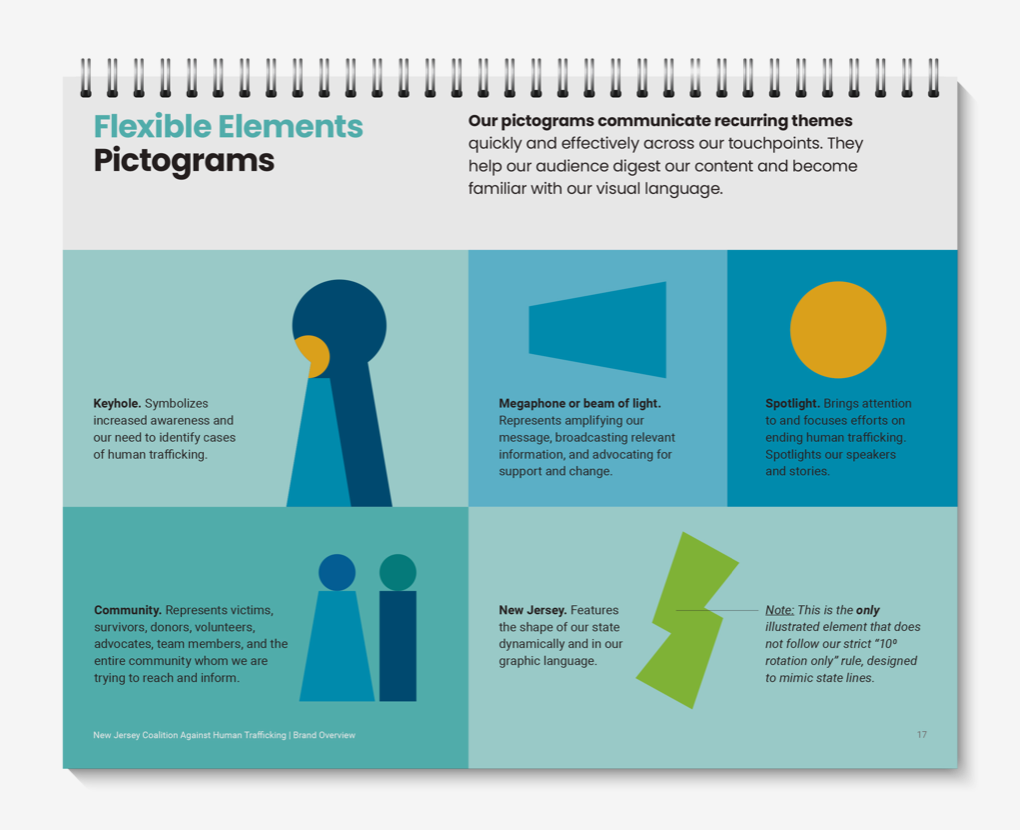
With pictograms and universal signage in mind, we designed a visual identity of simple geometric shapes the could emote, express urgency, and elicit response while still feeling approachable and widely accessible. The t-shirt combines the trapezoids from our geometric visual vocabulary to create a simple yet energetic graphic for audiences of all ages.
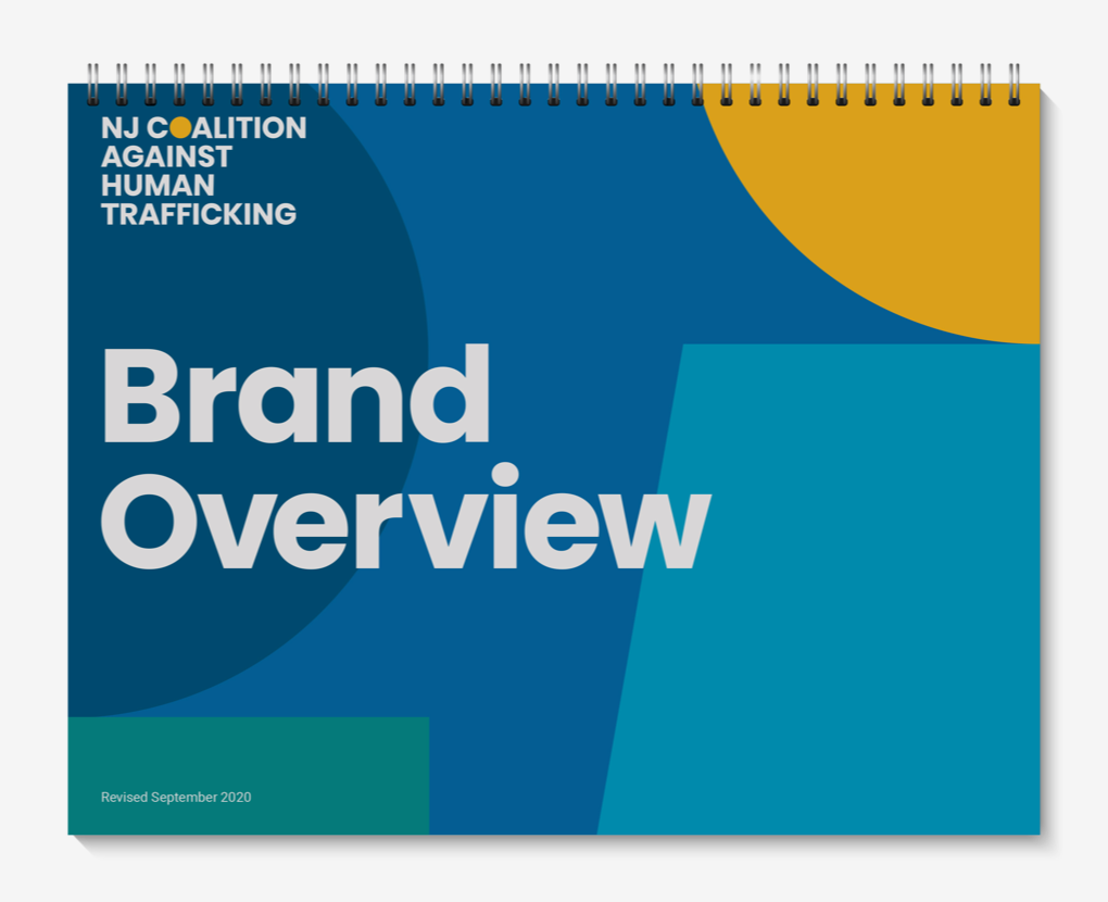
Finally, we created a Brand Overview document outlining the creative strategy and rules for the Coalition’s entire editorial and design system, so members can develop future materials with confidence.