Radiant Logistics
Brett led this project during his 17-year tenure as Thinkso’s founder and executive creative director.
We gave Radiant Logistics’ network of websites a massive upgrade — tightening up their brand identity in the process. We rewrote all of the content, fine-tuned the user experience and interface, introduced new technology, and generally brought everything up to the same level as the quality and precision of the work they do everyday.
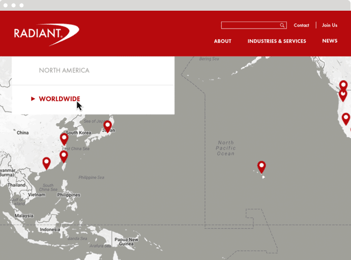
Radiant always points to its network as the thing that sets its business apart from the competition. It was also the linchpin to the creative strategy as we had to accommodate so many different constituent sites all laddering up to the corporate site.
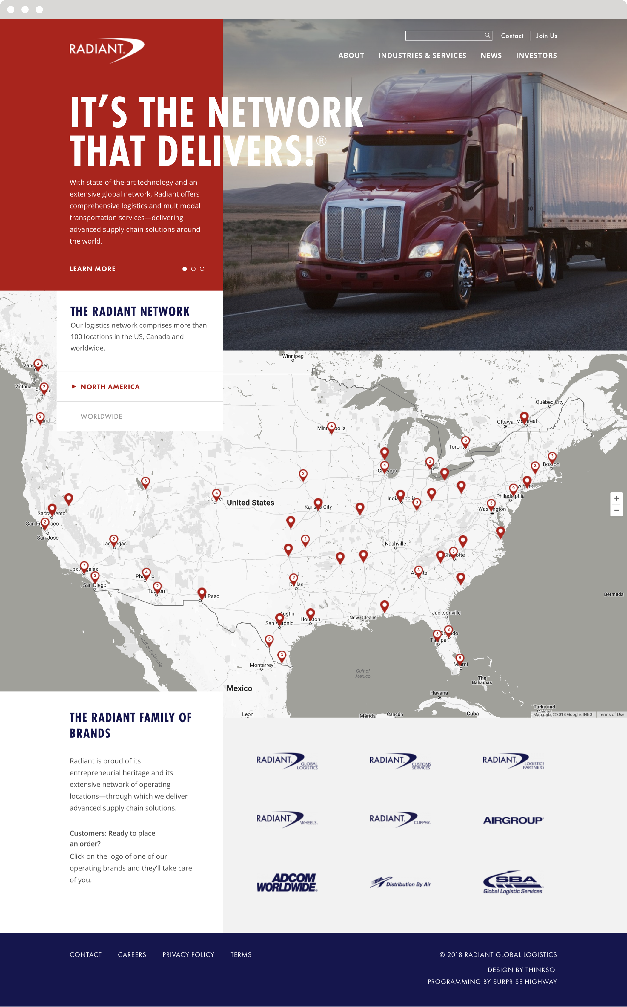
To emphasize Radiant’s wide network, we designed a large, interactive map on the homepage that also serves as a station locator.
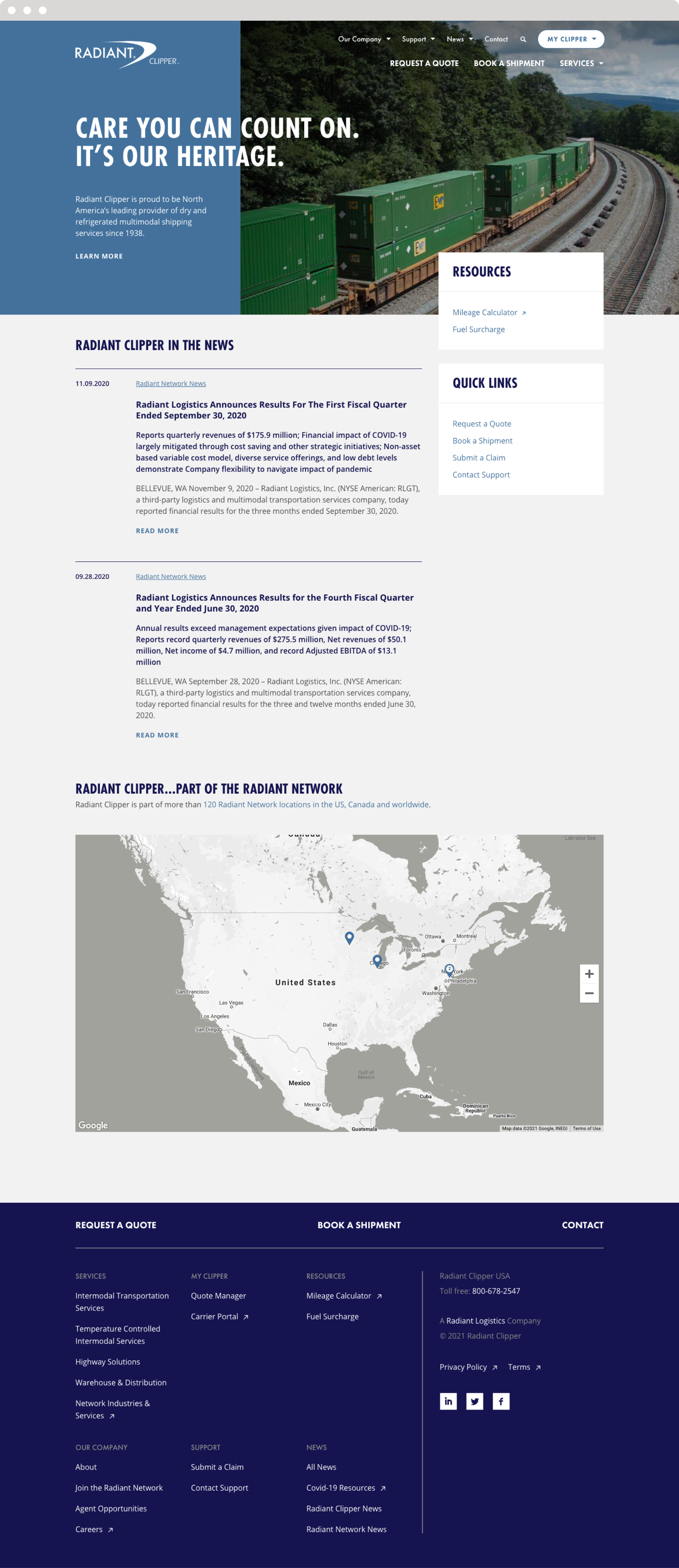
We created easy-to-use customer widgets for the subsidiary sites so that customers could request quotes, track shipments, and submit claims immediately from each homepage.
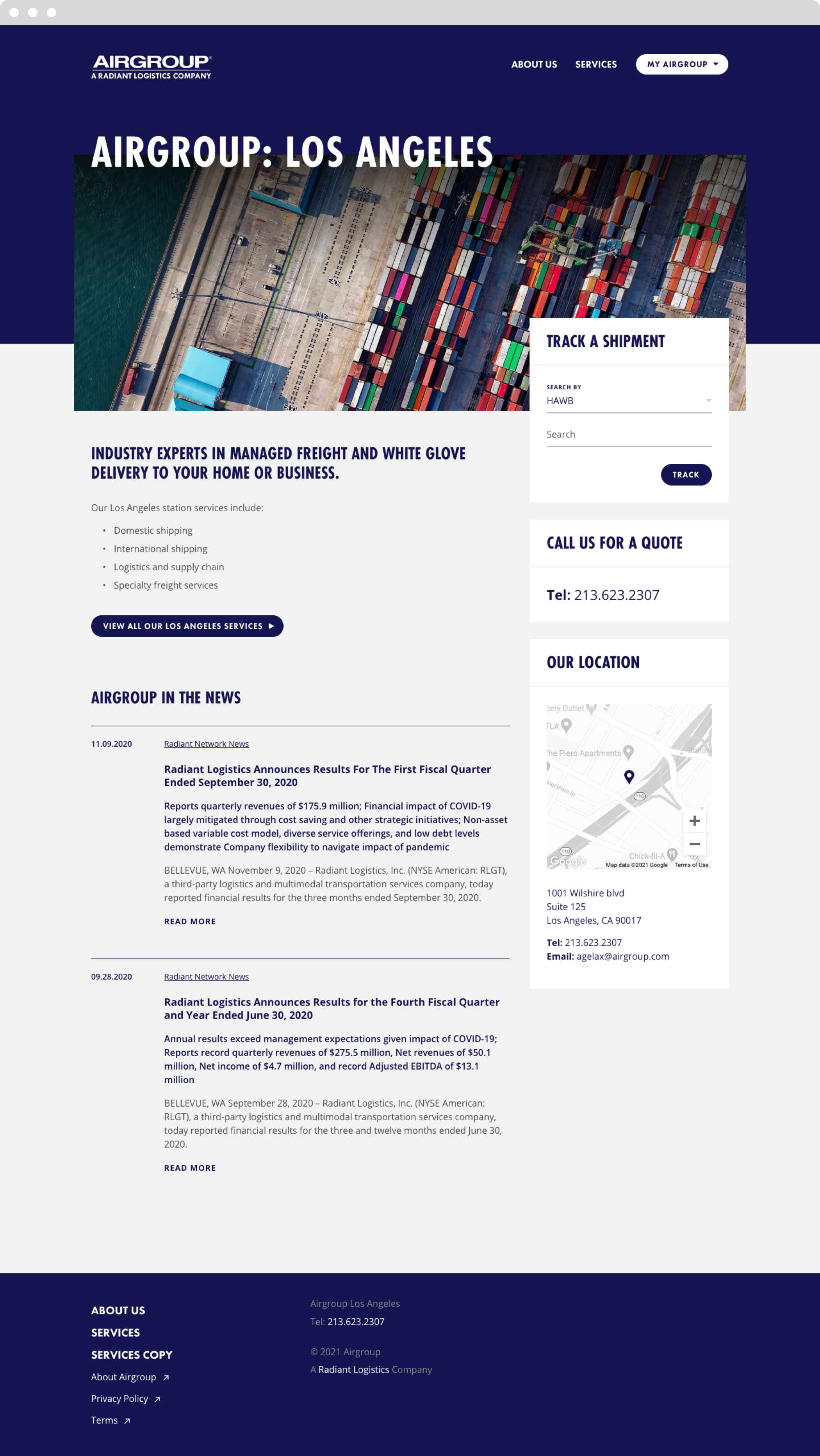
To ensure brand consistency and create an easier lift for station owners, the station website template drew directly from the look and feel of the subsidiary sites. It uses the subsidiary's site architecture, content strategy, and color palette, but gives station owners the opportunity to insert their local messaging.
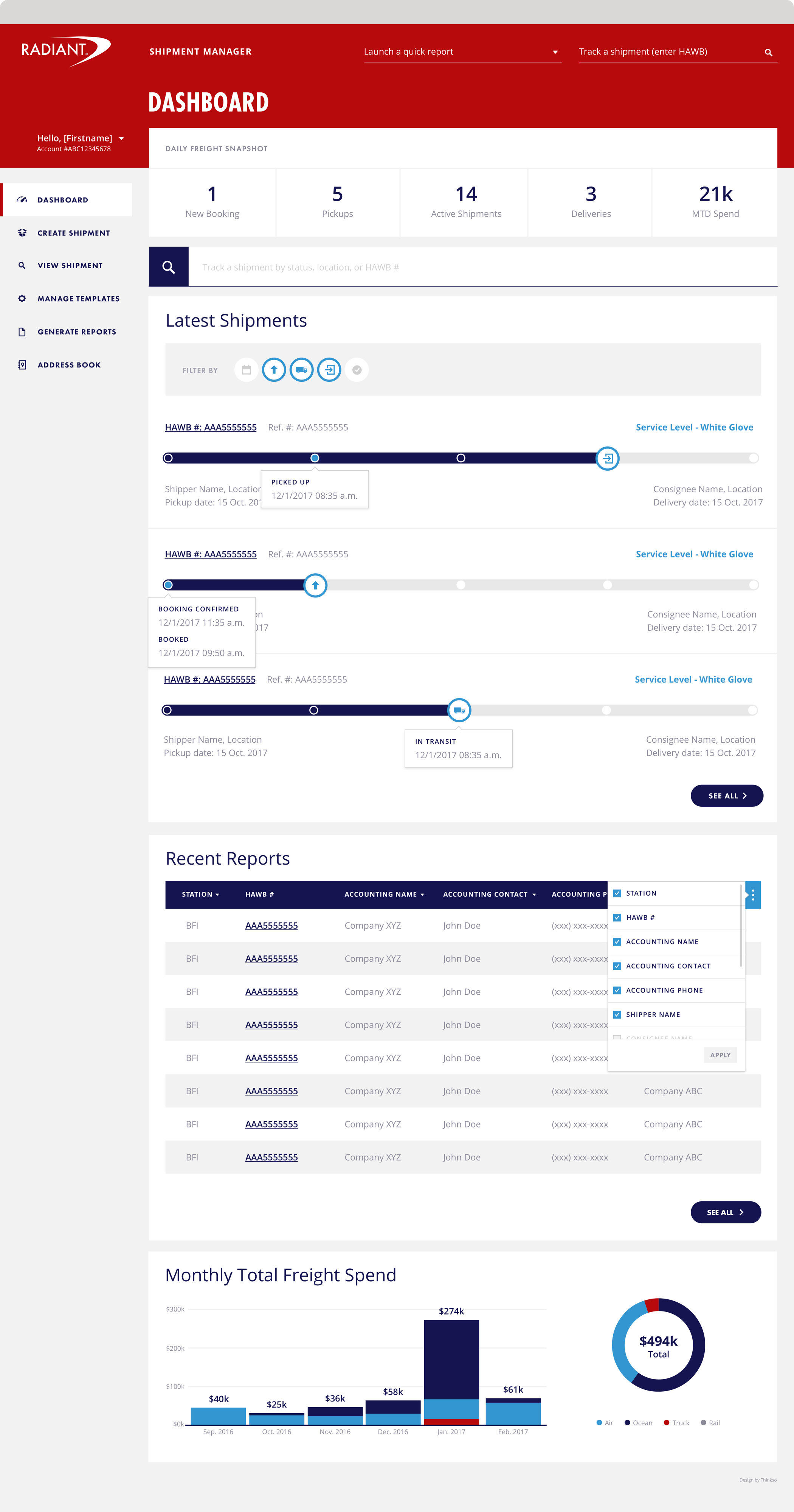
We redesigned Radiant’s customer portal to reflect the design and user experience of the external sites, while also making booking and tracking shipments more user-friendly.