Rodeo Plastic Bag & Film
Brett led this project during his 17-year tenure as Thinkso’s founder and executive creative director.
The Texas-based plastic bag manufacturer was preparing to enter the retail market with an innovative recycled product made from reclaimed agricultural plastic. We leaned on Texan humor and southern spirit to create a brand identity and tone of voice that expressed both product durability and sustainability, setting them up for success.
The rebrand tells our unique story with clarity and impact. With it, we’ve renewed our credibility in the eyes of our customers and employees — spearheading our entry to the national retail market.
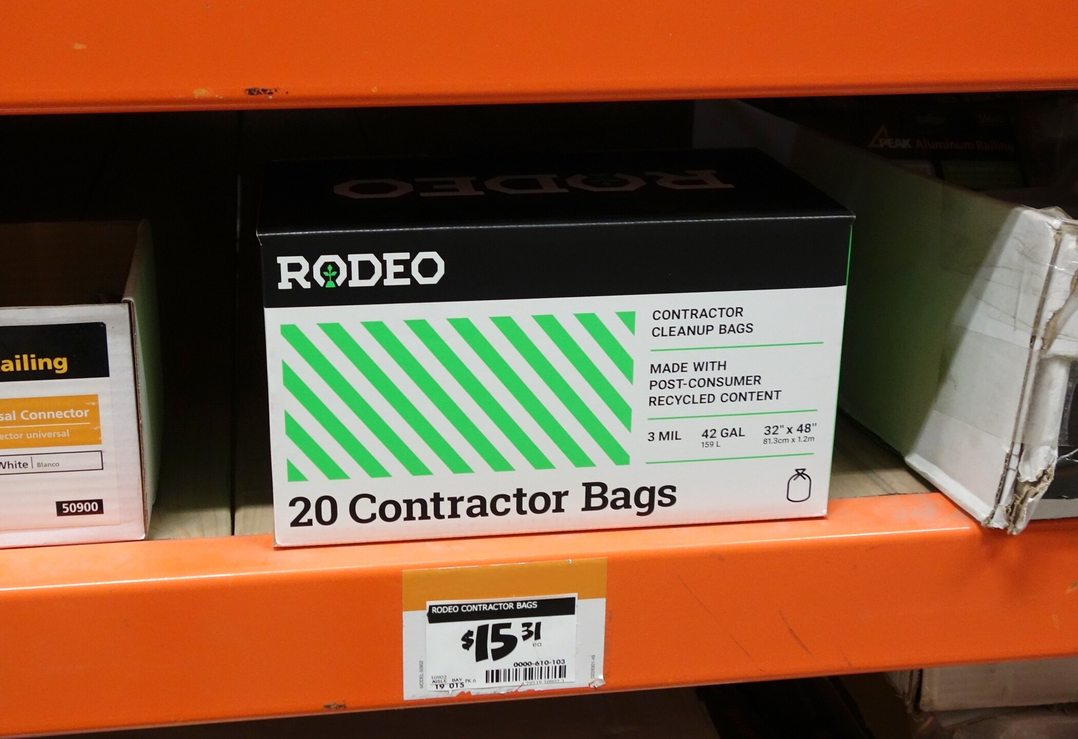
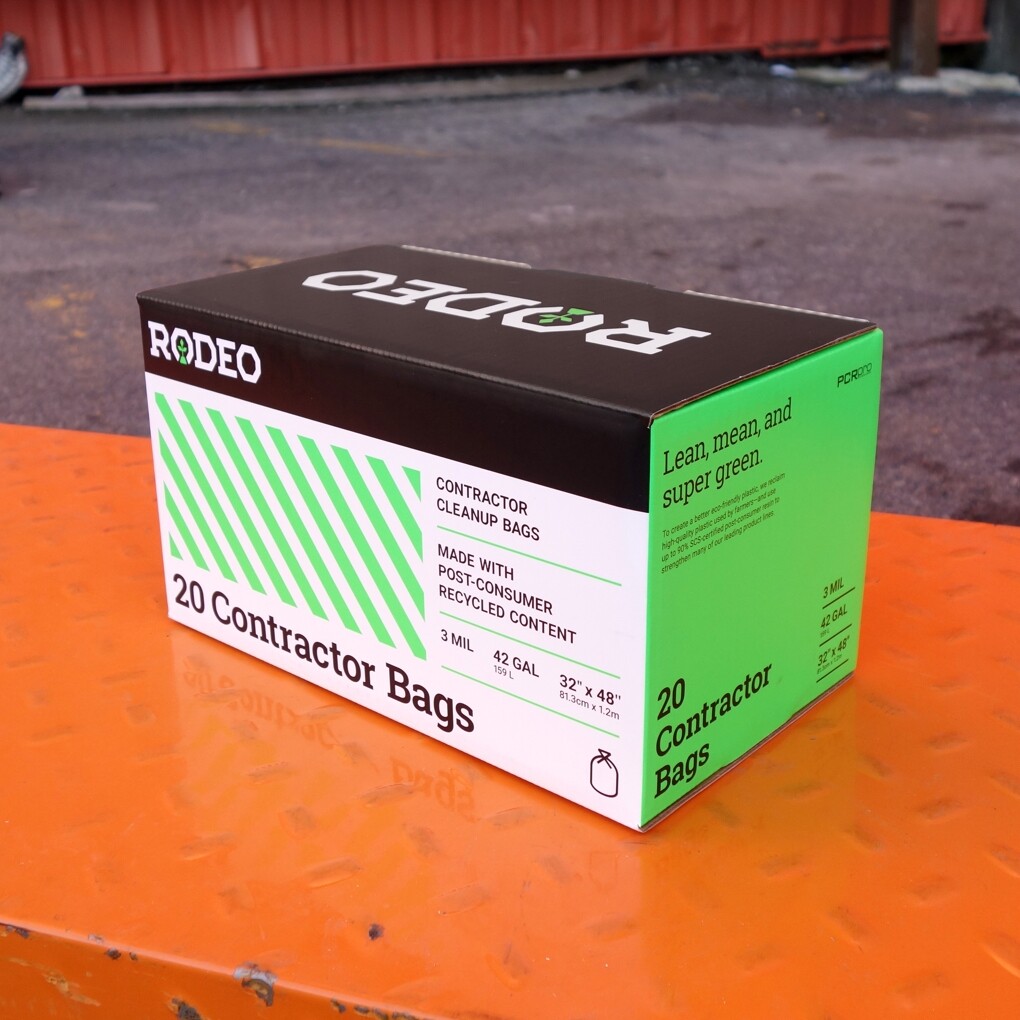
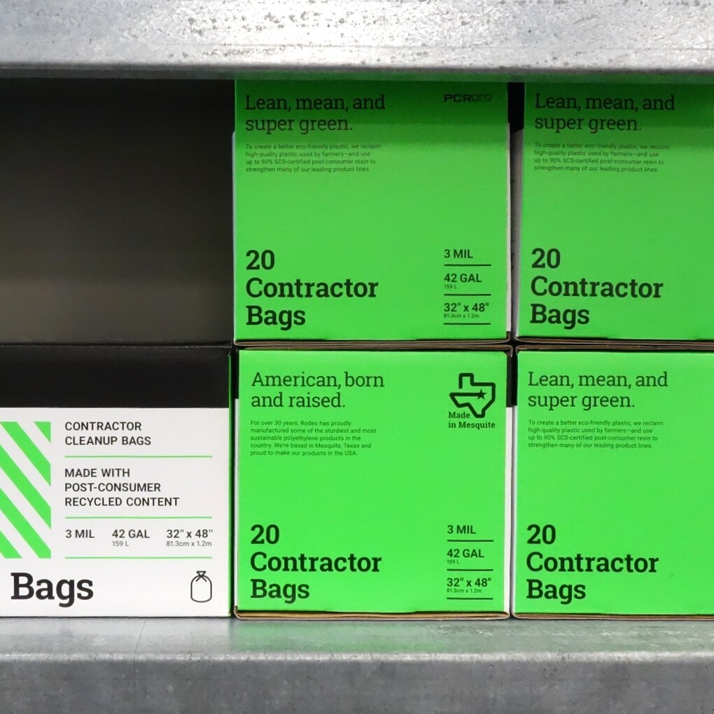
Packaging features a combination of Rodeo’s signature fluorescent green and black colorway—contrasting nicely from an overuse of yellow and orange by competitors. Safety striping helps communicate an industrial-grade quality and strength, while further underscoring Rodeo’s commitment to sustainability.
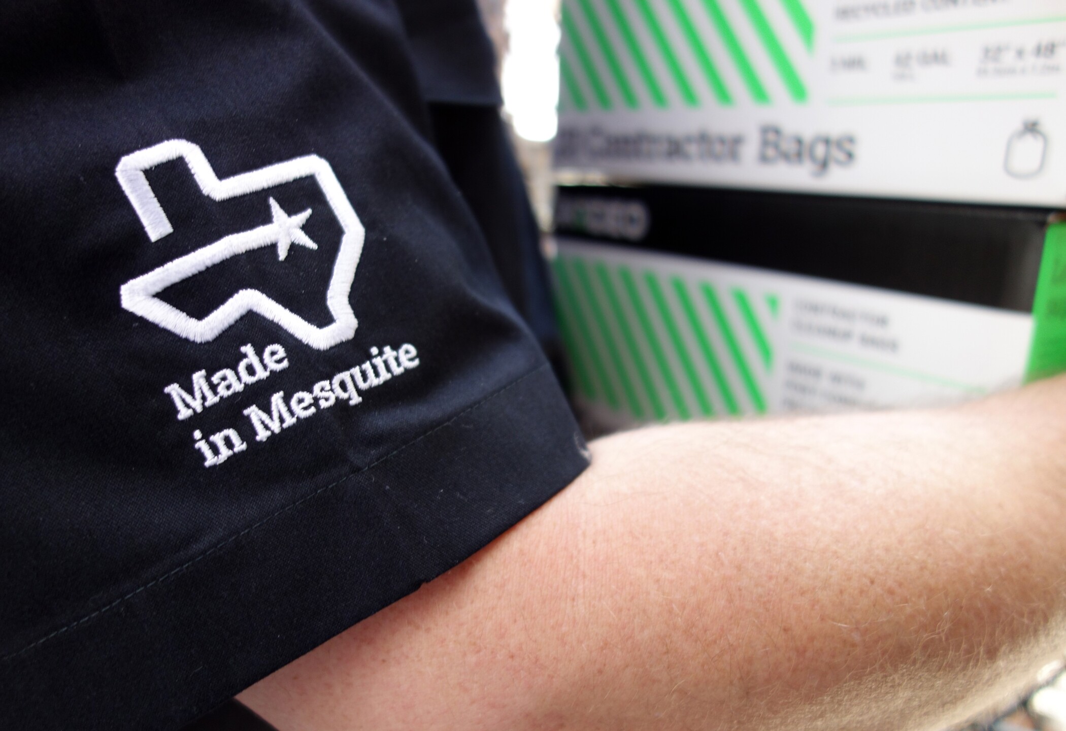
To avoid the appearance that Rodeo was jumping on the “MADE IN AMERICA” bandwagon with many of their competitors, we suggested a more genuine approach. The company is headquartered in Mesquite, Texas—home of the famous Mesquite Rodeo and a place known for the pride it takes in its local community. By indicating that their products are “Made in Mesquite,” we emphasize the hometown heroes and “Made in America” aspect in a distinct, true-to-brand way.
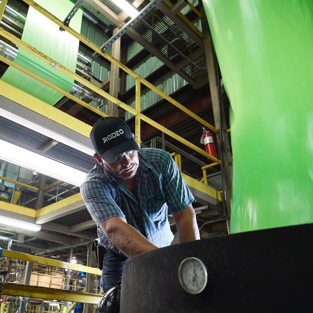
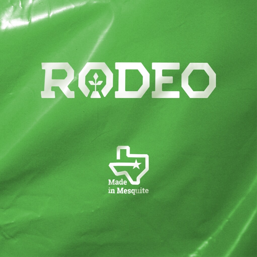
Plastic bags and sheeting begin life as resin, in pellet form. The resin is melted and blown into vertical tubes several stories tall, before cutting it down into bags. We worked with Rodeo to formulate a shade of green plastic to approximate their signature color. An otherwise generic product could now be printed with their new logotypes to create a more ownable, branded consumer product.
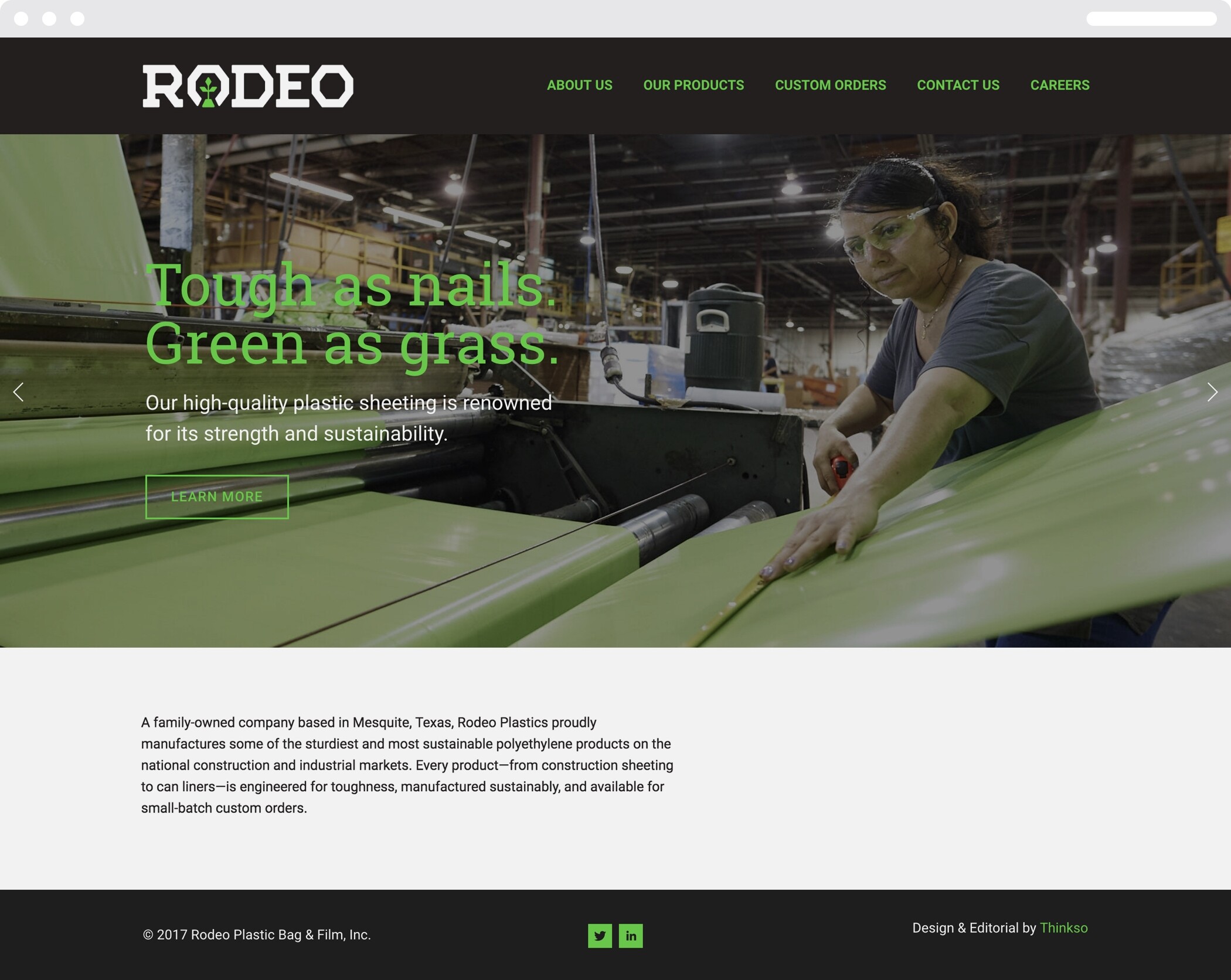
We organized, wrote, designed, and built the new Rodeo website, on a budget. Headlines inspired by Texan-style idioms provide moments of wit and personality while most of the site is geared to serve its core purpose of communicating product specs.
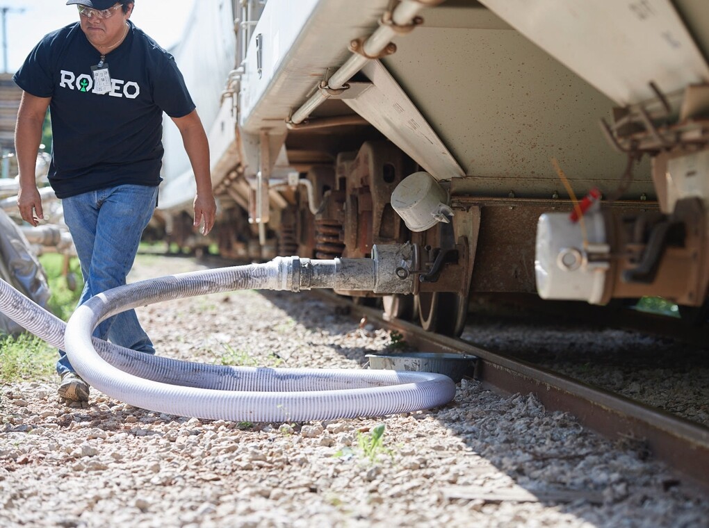
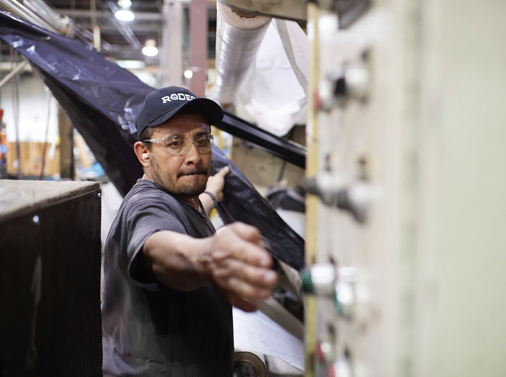
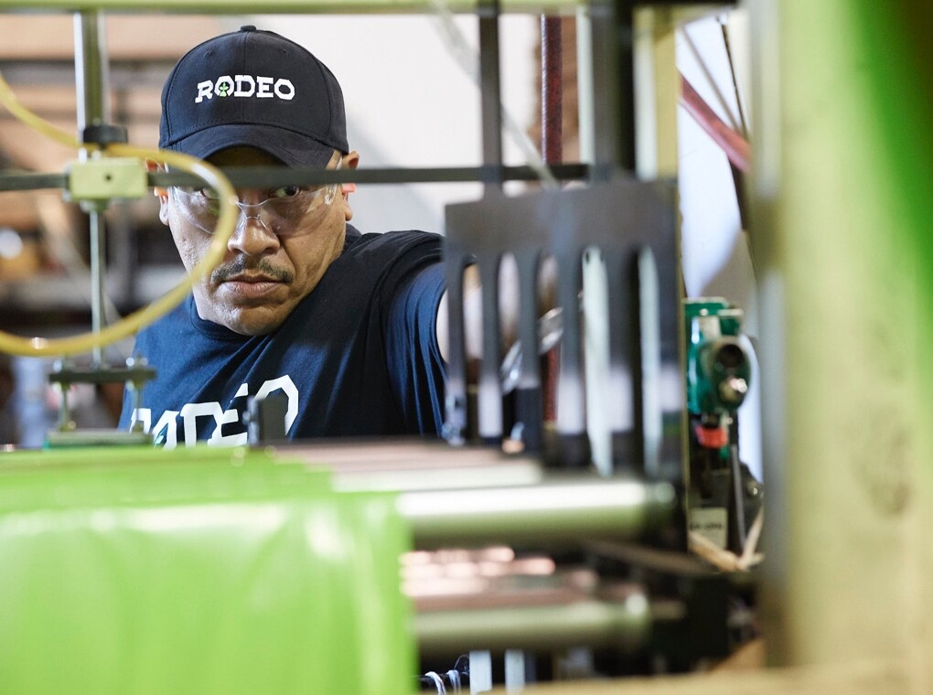
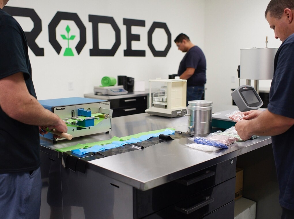
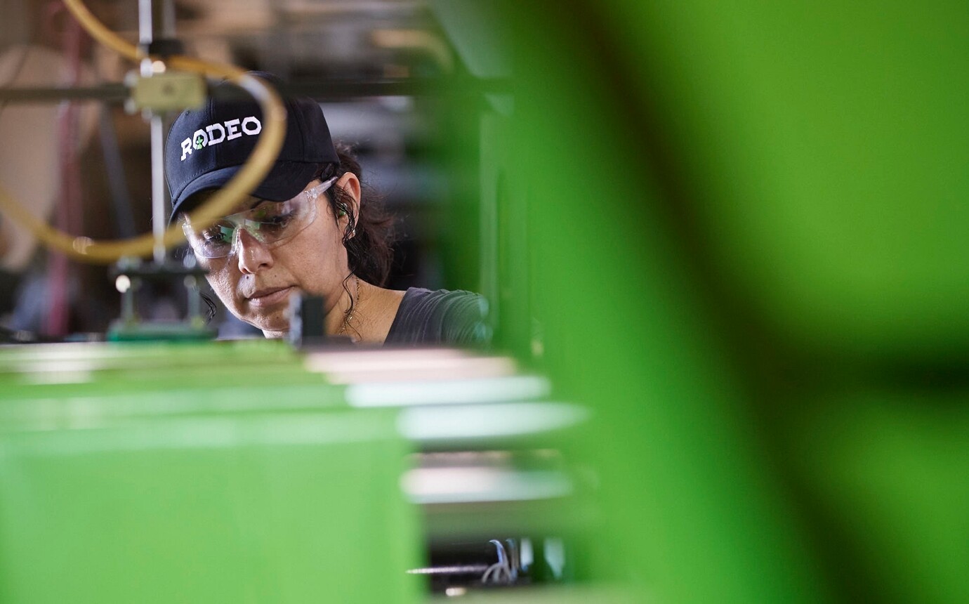
We spent a day at Rodeo’s plant with acclaimed Texan photographer, Tom Hussey, creating a library of custom photography for Rodeo’s new brand identity. We featured the faces of their hardworking people doing their jobs in a genuine, unvarnished way—underscoring Rodeo’s no-nonsense, hands-on, image.
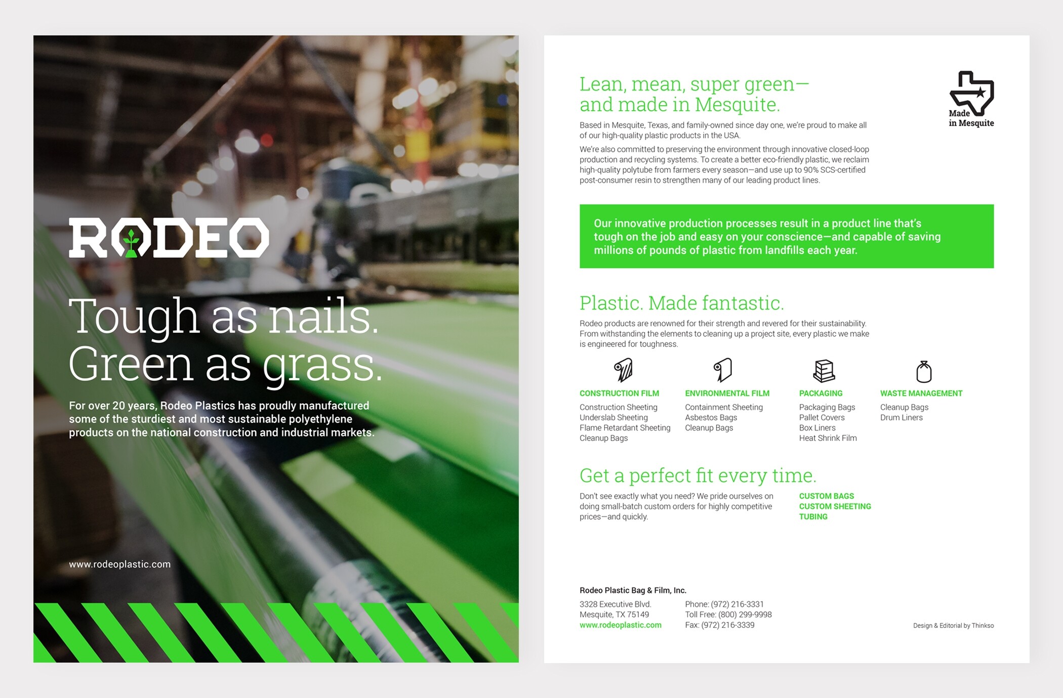
A simple one-sheet overview brochure communicates the brand’s core values and offerings, easily mailed or handed out at events.

We created a set of ultra-simplistic icons that evoke industrial safety graphics to help distinguish product lines.